brandOn 2012—2019 Design & Web development
Up Syndrome. Hybrid app v2 (image)
The mobile applications are very magnetic for anyone and little Yonatan is not an exception here. The main idea behind this app is to make the devices user-friendly also for kids with special needs that have challenges that regular kids are not dealing with, to better help them get the sense of interaction with modern communication tools such as smartphones and tablets.
Up Syndrome. Hybrid app v2

The mobile applications are very magnetic for anyone and little Yonatan is not an exception here. The main idea behind this app is to make the devices user-friendly also for kids with special needs that have challenges that regular kids are not dealing with, to better help them get the sense of interaction with modern communication tools such as smartphones and tablets.
brandOn UX-first. WebTalkTo v13
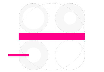
Application rule for the main decoration object - the line. The line should be applied on the right side of the parent object, visual reference to the heart, from point of view of someone who is looking at it. On & on. In other words - nonstop. If you want your business growing successfully, you need to be ready to work hard – nonstop, on & on.
BMAD. Brand identity (image)

We are a reflection of what we do. Look at our work.
BMAD. Brand identity

We are a reflection of what we do. Look at our work.
“The crown”. BMAD branding. Alternative versions
I want to believe that emotions are something you can transfer into your creation, at least this is what I think I usually do :) In my opinion any created object (logo for example) communicates with the world mainly on emotional level, the emotions are like soul that was given to object by his creator, god or designer it is quite same for me.
EG. Logo and website front page for Evan Godon
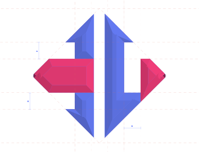
The idea to incorporate the Self-Closing Tag into the symbol flows from the fact that Evan is a front-end developer focusing on the development with React framework. Thus the symbol meets another formatting rule.
“No. Be a better leader”. App concept
User instructions: practice whenever you feel your team can do better.
WebTalkTo v11
WTT 11 is improved version 10. Because of major changes I have decided to name it v11.Each work on the works page presented with the logo and not with the image, as it always was. The reason is that the logo is visualised concept that has impact on entire work. Logo is most condensed element in the set of the composition elements.
Notes. Online Kotel Notes v2
No one will remove your Note from here!Not everyone has time and money to visit the Kotel in the great Jerusalem and place his note in the Western Wall. Thus, born the Online Kotel concept. Now you are able to place your note any time, from any place, completely free and discretely with the Online Kotel Notes web application.
MA. Individual two letter monogram
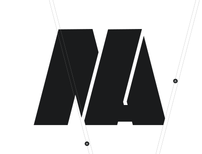
The line that divides the letter A in two will have equal width all the way from top to bottom. The "a" rule will help to have better harmony between parts of the shape.
Cssfox 5. Web designers' community
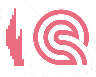
Cssfox community is a place to showcase websites, receive web design awards, find an inspiration for a web design project, learn web design from the greats and interact with people that have similar interests.
"OH MY". Social app
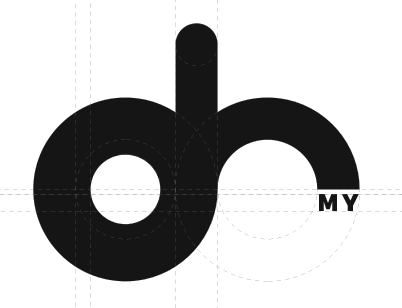
An impetus for this work was the "Oh" monogram concept.
"Resting spinning top". Tatar Culture Centre MIRAS
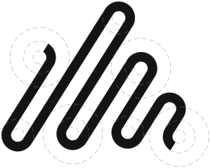
The spinning top resting on its side symbolises the fact that without a person's participation there cannot be any heritage (movement). This concept highlights the people's involvement and prioritizes the human factor...
"YOUNEEDIT". iOS social app v2
YOUNEEDIT is an emotional balance reporting social app allows person to document emotional balance, share and control it through the use of iDevices and iAssistive technology.
"D&D in one bag". WebTalkTo 10
We do not use cookies so you won't get extra weight!
“Music feed”. JamHeart
Centralized music discovery and streaming for the internet.
Domilia
Web app that offers free online solutions for disabled people, more specifically with mobility challenges. The goal is to help make life easier for people with mobility challenges by offering them a simple way to access the resources they need on a daily basis.
"Crying heart". United States Holocaust Memorial Museum
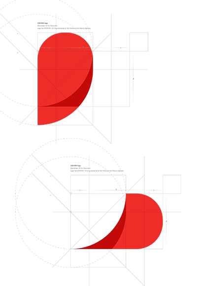
Let's use two halves of one heart (breaking heart) to create a crying eye. Anyone that is emotionally connected to the tragedy has a broken heart at the moment of the emotional connection and crying eyes, figuratively at least.
"Revolution". Longbow Advantage
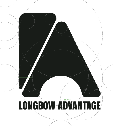
By changing the distance between two central points of the longbow, the height of the logo can be controlled and adjusted relatively. Thus was born the responsive brand mark concept.
WebTalkTo 9.1
It's the accidental that initiates the serendipitous. Be open to the unexpected!
Fox Log v3.2
Cssfox's place d'armes for interviews with web designers, stories about websites creation, news and other things related to our lovely Cssfox.
Online Kotel Notes
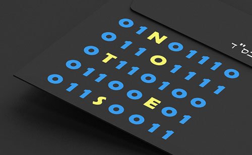
No one will remove your Note from here!
Maxim Aginsky résumé 2014-15
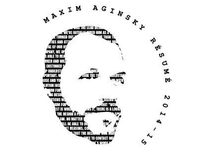
When I am seeing a design from Maxim for the first time, I have that WOW reaction, but the best is when he explains it, there is a logic behind it that gives the design a personality, something special and hard to explain. - Francis Filion
Cssfox v4
While Oleg was developing the third version of the Cssfox, which was hand crafted - not like previous versions that powered by WordPress - I have ran out of patience and designed this v4, which finalised my relationship with the great WordPress CMS. Thus, happen interesting thing - the v4 was published before the v3 with the logo of the version 3.
Fox Log v3

Logotype for Yonatan
He is perfect!
Cssfox 3
Cssfox is a place to showcase websites, receive web design awards, find an inspiration for a web design project, learn web design from the greats and interact with people that have similar interests.
Fox Log v2.1
WebTalkTo 8.1
Different, often born out of ugliness. Let's misbehave!
Fox Log v2
What do the Foxes say?
CSS-Fox v2-2.5

You are Great. You deserve It!
Fox Log v1.2
WebTalkTo 7.1.3

Fox Log v1
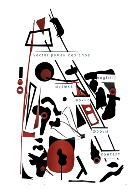
Vector. Novel Without Words
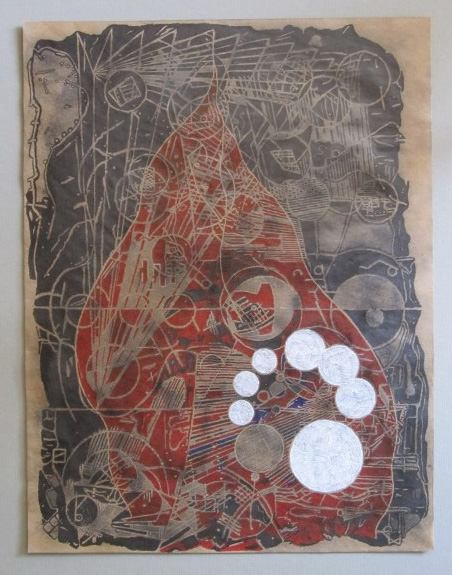
Maxim Aginsky creative biography 2006-2010. "And I gave you five rings and said wear them".
Black Swan. Typo-Graphy experiment
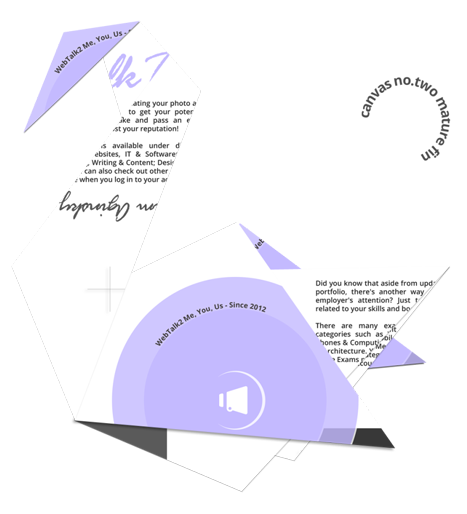
WebTalkTo’s version 7 portfolio experiment and real time improvisation. This work is dedicated to the greatest Charlie Haden.
Cssfox v1+
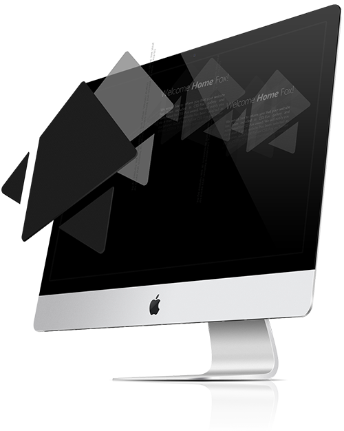
Cssfox 1 one page presentation.
CSS-Fox v1
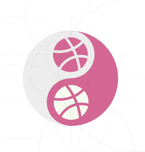
“Yin and yang”. dribbble logo concept
“Story 6”. WebTalkTo 6 one page teaser
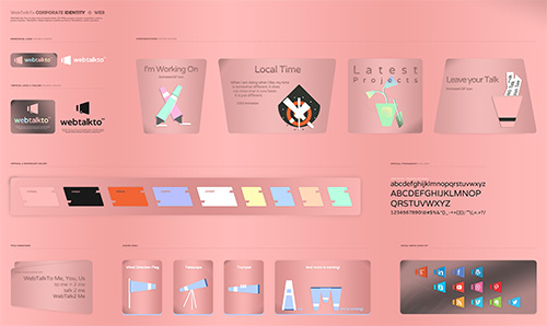
WebTalkTo 6
"Pointer". emAPPetizer
I developed this monogram at the position of Lead Designer at emAPPetizer Inc. a private Montreal-based mobile application development corporation.The goal was to have something that associates with the fingers, hand. Finger like a main instrument which helps you make use of the app.Em - two letter monogram, “e” and “m” in the emAppetizer name is the abbreviation of two words - enterprise mobile (if i remember correctly :). The previous logo concept was based on the “e’m” idea, e’m like the I’m (I am). This two letters (em) always played significant role in my creation process at emAppetizer.
Maxim Aginsky v10
Zichron Kedoshim Congregation
A design for website is like a ripening fruit – to be able to get the right feeling-flavor you need to give it some time and right “weather”.
Chaya Mushka Seminary
On December 31st 2013 I had a meeting with Rabbi Abraham Cohen and Rabbi Michael Dahan – director and dean of the Chaya Mushka Seminary.We talked about the goal of the project and also what and how should be displayed for the public. Remember, we are talking about site design for religious organization – Chassidic seminary for girls.
Maxim Aginsky v9.3
Caterpillar. Decoration concept for kids room
"Too Simple". WebTalkTo 4.2
Content on the white page and that is it. Just one template for all pages.
The Tree. Bulletproof website theme concept
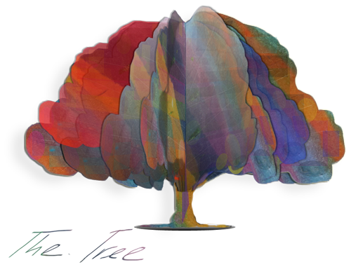
This one page website illustrates the concept I have created in beginning of 2013 - "Concept. WordPress theme”.
Compositions with seven notes. HTML Lego
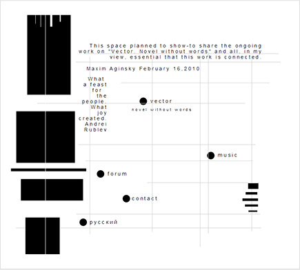
The HTML melody? To compose the web pages of this series, I used an HTML visual editor and a mouse :)
Women on the Rise v1, 2
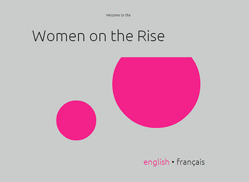
The individual comes to the group – is a key for the site design. This simple concept I have kept in mind all the time while creating the site.
"But Beautiful". WebTalkTo 3.1
The third version of WebTalkTo site has different templates for all possible pages. The main design idea discloses in combination of the navigation menu and image below it.
Website for Sofi
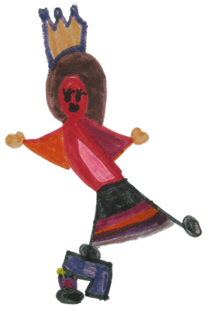
I designed and built this cool website for my creative daughter.
JPL Jewish Public Library Montreal
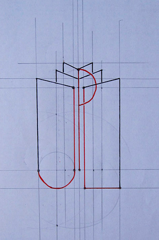
Composition consists from two elements: Menorah and The Book. The Menorah “stands” on The Book. The Book is the base for Jewish existence.
Canadian web design ideas festival
Let’s make this world more connected by creating and sharing beautiful ideas with each other.
"Square". Free WordPress theme
Square is a modern and fully responsive WordPress theme.
JPPS-Bialik 100th Anniversary Logo Festival
By sharing beautiful ideas with each other we can make this world more connected and then, we can try to create a better world.
Argo Transport
We started from scratch. When we started, the old Argo Transport website did not appear even among 20 pages of the Google search. After only two weeks we got very impressive results.
"Concept". WordPress theme
The main plan on which site navigation locates (navigation is extremely important for a site, it is possible to compare it to necessity of roots for a tree) is stretched in width on all screen, from left to right. For simplicity we will consider that this plan is monochrome. And so, this plan is a basis or the soil from where bud growths or a tree or graphic structure – visual identifiers of the business concept of the client.
Paul Motian theme
His music philosophy - as I see it - is paused (holes). For a drummer player this is most unusual concept.
Copenhagen Festival Ensemble v2
The first version of the website (2011) was written in AS3 - flash animation. Animation is a powerful tool to convey emotion. For several reasons in 2013 we rewrote the website in HTML and to some extent I am sorry for the loss of the Flash animation effects.
WordPress themes
Create a website with WebTalkTo using our theme. All you have left to do, is filling in the pages with content to get your dreamy website.
WebTalkTo 2
Home, store page and blog page completely different. Each of those templates has their own design conception, but at the meantime this three different templates complete each other and together compose one solid piece.
Copenhagen Festival Ensemble

The image is dark, but real. We tried not to distort the reality of things and base the choice of key elements on the impression of communication with the client in combination with analysis of the environment of the client. I planned that this image combined with the Visual Identity (optimistic, colored, mainly uses the geometric morphogenesis) would cause a feeling of serious, honesty, respect and celebration.
Papadu .org, .ca
Papadu - bicycle ads. Sell and buy cycles products with Papadu.
Koleso-Montreal
All about bicycles and electric bikes.
Web Talk To (Store)
Shop with Andy Williams. Buy vitamins, supplements and natural products online.
AGINSKY CONSULTING GROUP
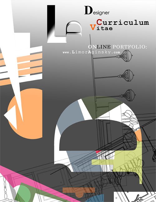
Limor Aginsky
Cycle Paul
Maxim Aginsky v7
Forum MA
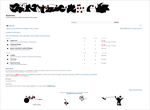
All, that in one way or another connected with the creation.
auto-transatlantiques, Andy Williams, Kicha studio, ajsm-aliments
