BMAD. Brand identity
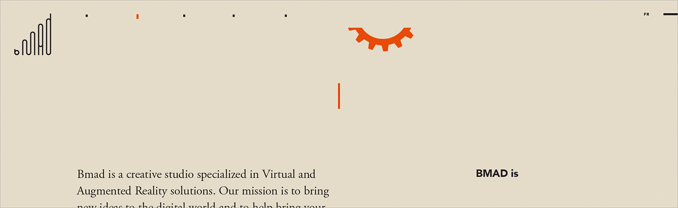
BMAD is a young company that is growing exponentially in a fast-moving environment. We produce a wide variety of AR & VR projects. We are mad about technology, we are mad about future reality and we are looking for creative people with the same enthusiasm for new technologies to join our team.
BMAD Montreal studio leverages its expertise in the development of interactive mobile applications and in creating augmented reality and virtual reality (AR & VR) experiences.
Table of contents:
Identity system
- Logo
- Icon
- Construction
- Clear space
- Icon clear space
- Logo and bottom located and brand oriented text
- Logo and right located text with company information
- Three and four lines text appearance rule
- Emphasizing text block with orange line
- Phone number format
- Two inline text blocks separation
- Brand colors
- Color usage
Graphic system
Application usage
Website
- Loader (entering the site)
- Home page (top section template for all pages)
- Top navigation
- Footer
- About page
Identity system
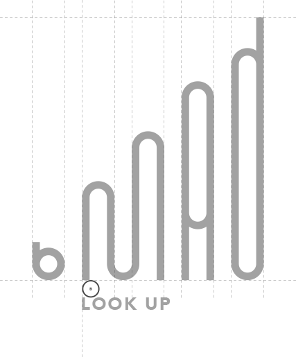
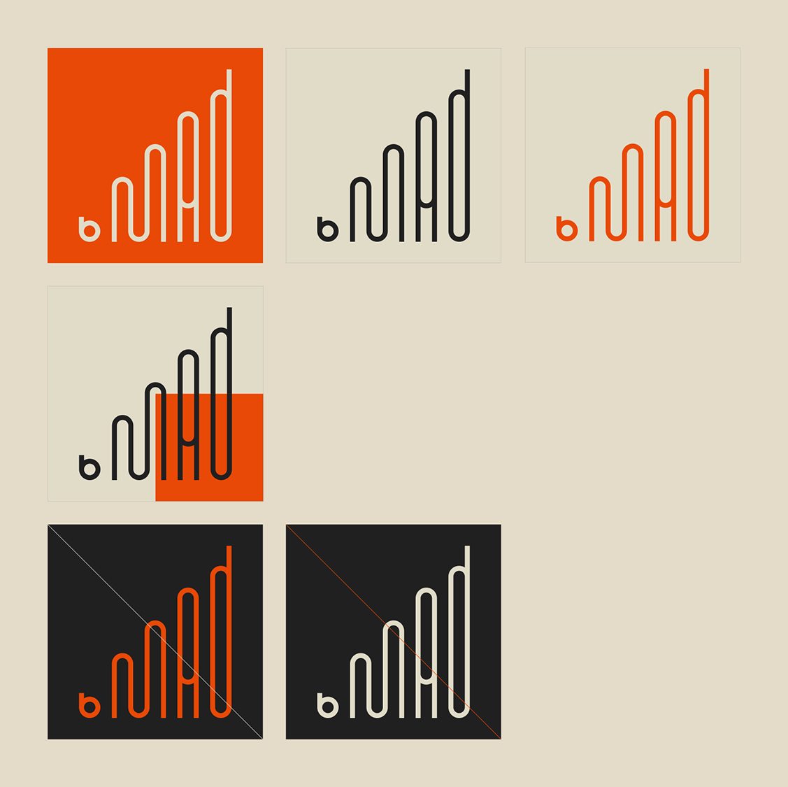
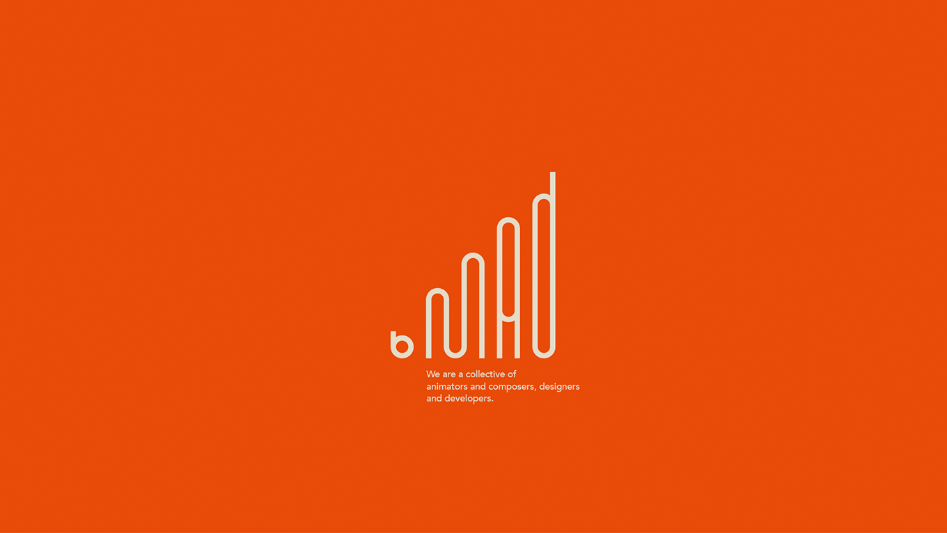
Logo
The logo symbolize dynamic, growing, developing organization (left to right). The shape based on triangle symbolize stability, in material word most stable object has three points of ground contact.
This look lends itself to a new era, taking a bold and modern typographic approach to match ever-growing brand.
The previous logo was constructed from four bold, uppercase letters of same size - BMAD, using one of the popular types, where the first letter B was placed in dark orange circle and used white color for better contrast with the dark orange. The other three letters used grey color. The circle with B and other three letters share same clear spacing, thus the B was emphasized - Be: Be mad, Be innovative, Be creative, Be unique... White B in dark orange circle also used like icon - separated from the rest of the construct, this element was used where small size of the logo needed.

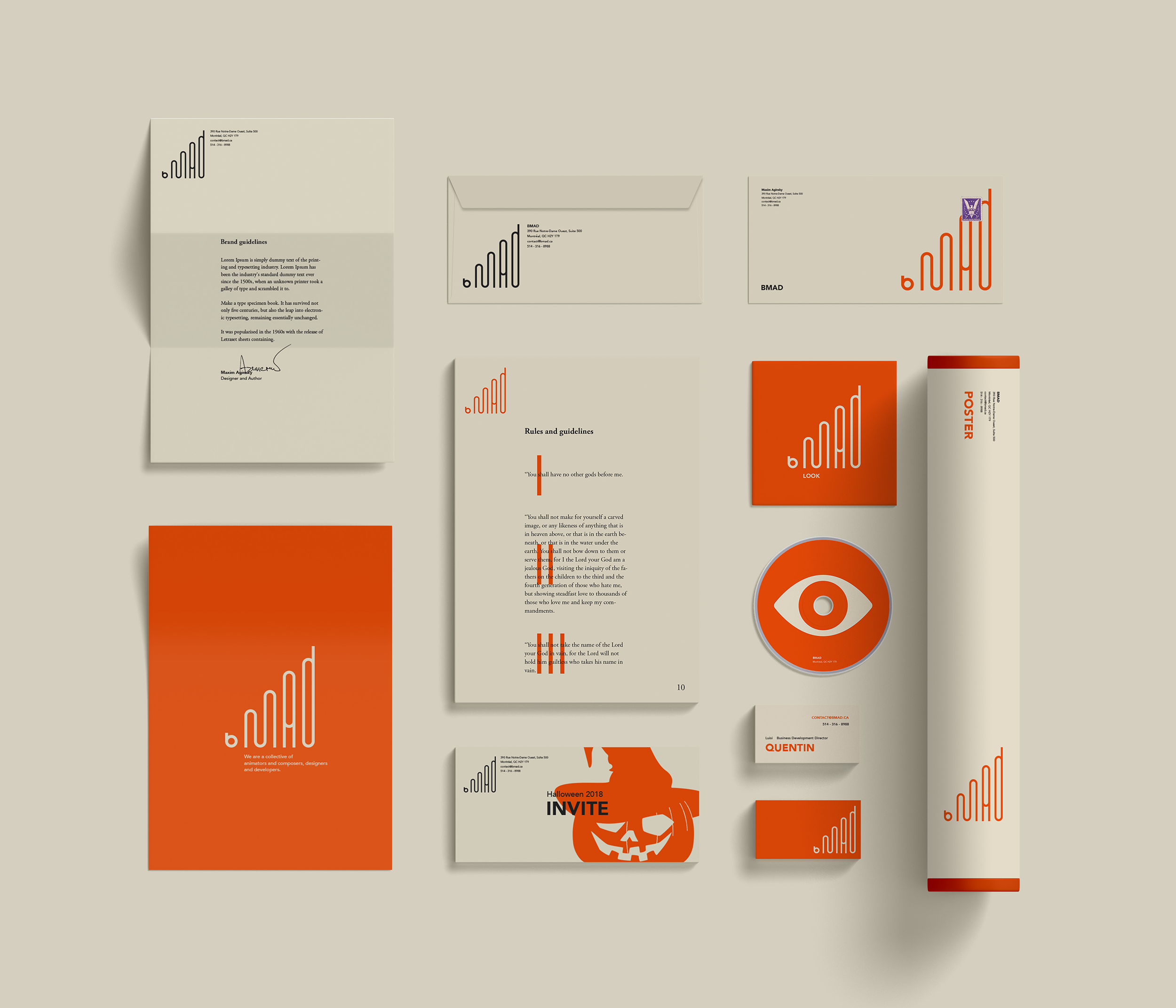
Icon
The icon is a first letter of the logotype. Mainly in use on small canvases and for small icons.
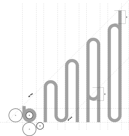
Construction
The development of the logo can be seen in its construction.
As the logotype is solely in lowercase letters, the x-height is its most important feature. Hence the x-height of the "bmad" becomes the A measurement of the logo.
The B measurement is a inner empty space which is used to measure clear space between the logotype elements.
45 degree rule creates a half of the quadrate - right triangle.
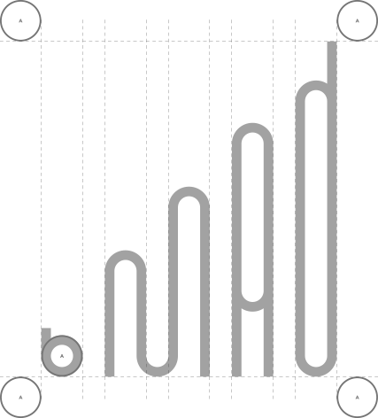
Clear space
A is then used as the clear space to surround the logo. This clear space helps to maintain the integrity of the logo in making sure that other elements are far enough away to not compromise the brand. Clear space helps the logo maintain its attributes.
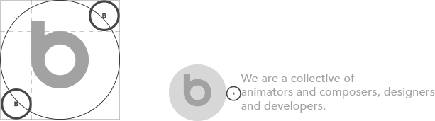
Icon clear space
The icon will use the B measurement (inner empty space) as the clear space between the mark and surrounding background (square or circle). Also B will be used as the clear space between the icon and its background and other objects surrounding it.
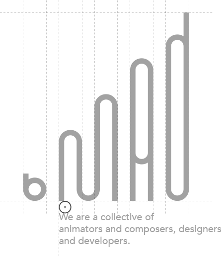
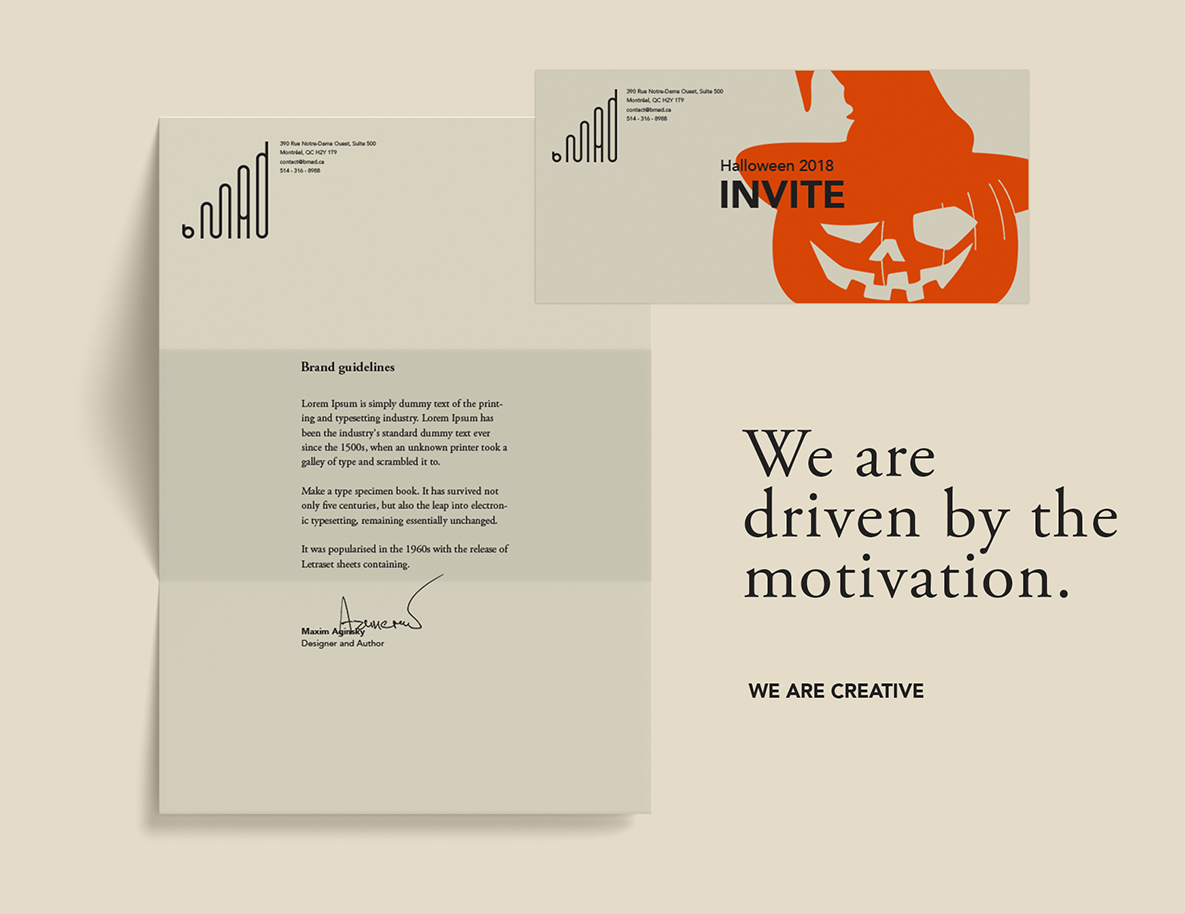
Logo and bottom located and brand oriented text.
Spacing and position rules
The logo will use the B measurement (inner empty space) as the clear space between the logo and bottom located and brand oriented text. The clear space is A, but in cases when text is related to the brand will be used B measurement, the smallest allowed clear spacing.
The text located below the letter M, keeping the letter B separately. This is visually underline the original logo idea - BE MAD.
Logo followed by company description.
Logo followed by a few words message.
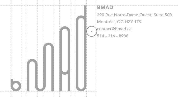
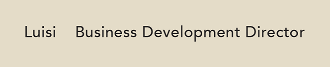
Logo and right located text with company information.
Spacing and position rules
The logo will use the A measurement as the clear space between the logo and right located and company oriented text. The text block will be top logo line aligned. This construct mainly will be used in small sizes.
Logo followed by company address.
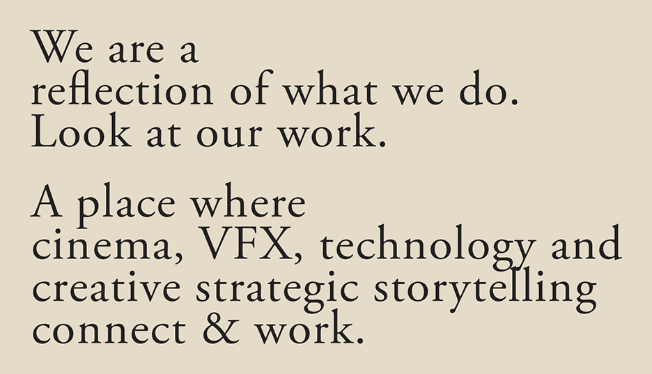
Three and four lines text appearance rule
Will try to organize three four and more lines of the text blocks: first and last lines are shorter than the middle lines.
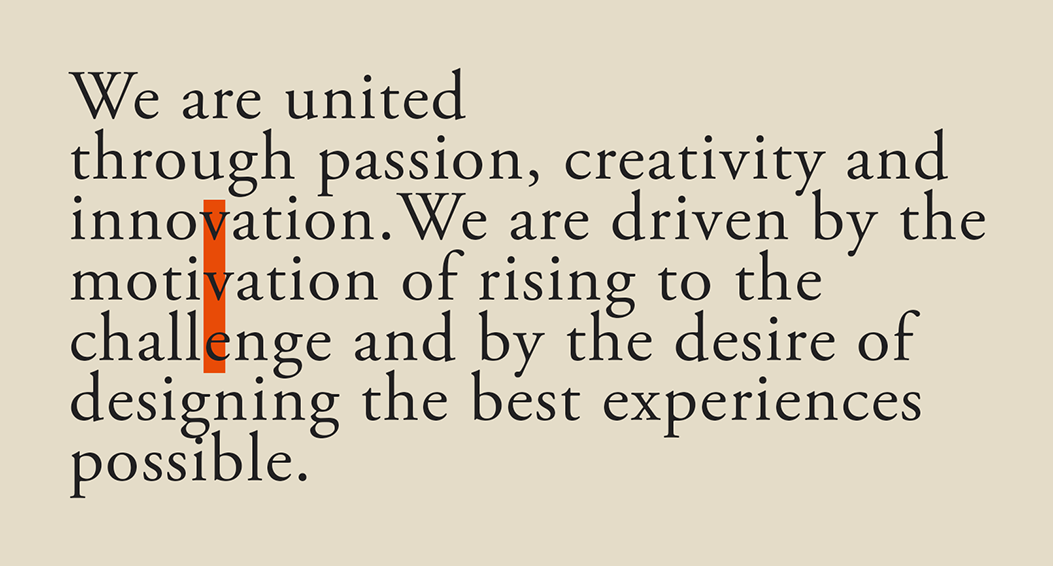
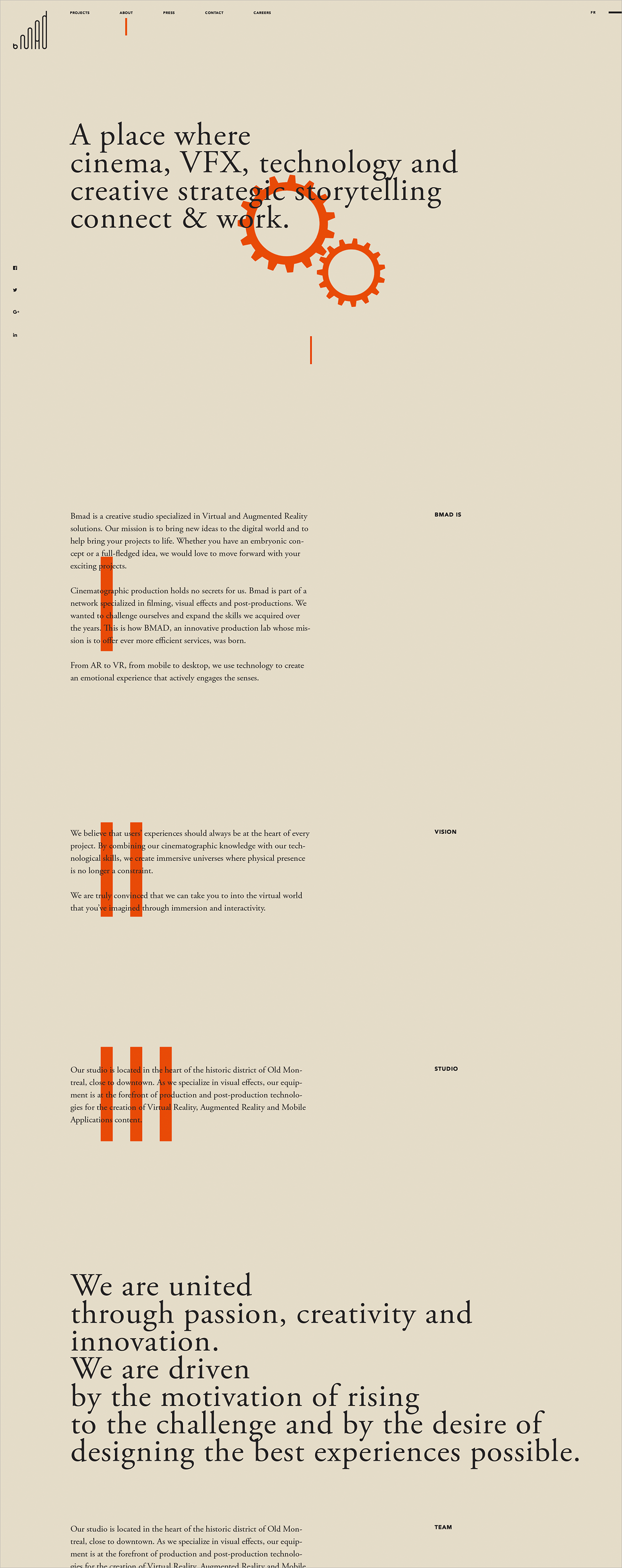
Emphasizing text block with orange line
If we need to highlight some of the text blocks to give them more importance than to others blocks of the information. Will be used vertically centered orange line that more close to left (if left alignment if right or centre use relatively) side of the text block as a symbol of number one. As well we can highlight each of the blocks inside a group with one, two, three lines and more. Here is clear association with the latin numbering - deep relation is a key to the brand successful integration.
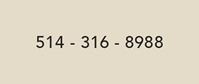
Phone number format
Twenty-four countries and territories share the North American Numbering Plan (NANP), with a single country code. The formatting convention for phone numbers is NPA-NXX-XXXX, where NPA is the three digit area code and NXX-XXXX is the seven digit subscriber number. The prefix NXX of the subscriber number is a code for the local central office, unique in the numbering plan area.
The phone number usually appears in small sizes. To increase readability of this important communication detail we double the letter spacing on the dashes of the phone number.
Two inline text blocks separation
As a separator of the two inline text blocks instead separation character we will use increased clear spacing.
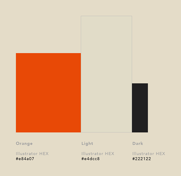
Brand colors
The brand’s colors dictate the mood and personality of the brand. The primary color was chosen because of the significant qualities that the company management team believe color orange holds. The previous identity system used dark orange, new identity will use lighter and juicy orange color, which has better contrast with the surrounding.
The image clearly showing the color hierarchy.
Color usage
The dark and light iterations of the logo shows how the brand holds when it is reversed out. This shows the legibility and flexibility of the logo on any backgrounds. However our brand wan’t use dark color as a background color.
Graphic system
Typography
Two primary typefaces: Avenir and Adobe Garamond Pro.
Avenir typeface (medium and bold) will be used: titles (uppercase), company description with logo, company information on stationary objects, website menu, email signatures and more.
Adobe Garamond Pro typeface will be mainly used for front matter - large font size and short text blocks in purpose to highlight some textual information and as body text - the main content of a printed and digital matter.
Photography
We will use detailed photos or summary photos not the middle solution. Very close or very far. For print or media: photo has straight corners and does not use any display effects such as shadow, border and other. We give big importants to the quality of the photos and other images we share publicly.
Exaggerated detail example.
Humpback whale.
Travel photographer of the year. National Geographic, contest 2018.

Exaggerated summary example.
Venus.
Catch Venus Before It Disappears. Space.com, article.

Application usage
Stationery system
Since Queen Victoria's reign (nineteenth century) stationery has been an important part of good social behaviour. We believe that personalized communication emphasizes our professionalism. Showing our customers and clients how far we went to stand out, will help them to make the right decision.
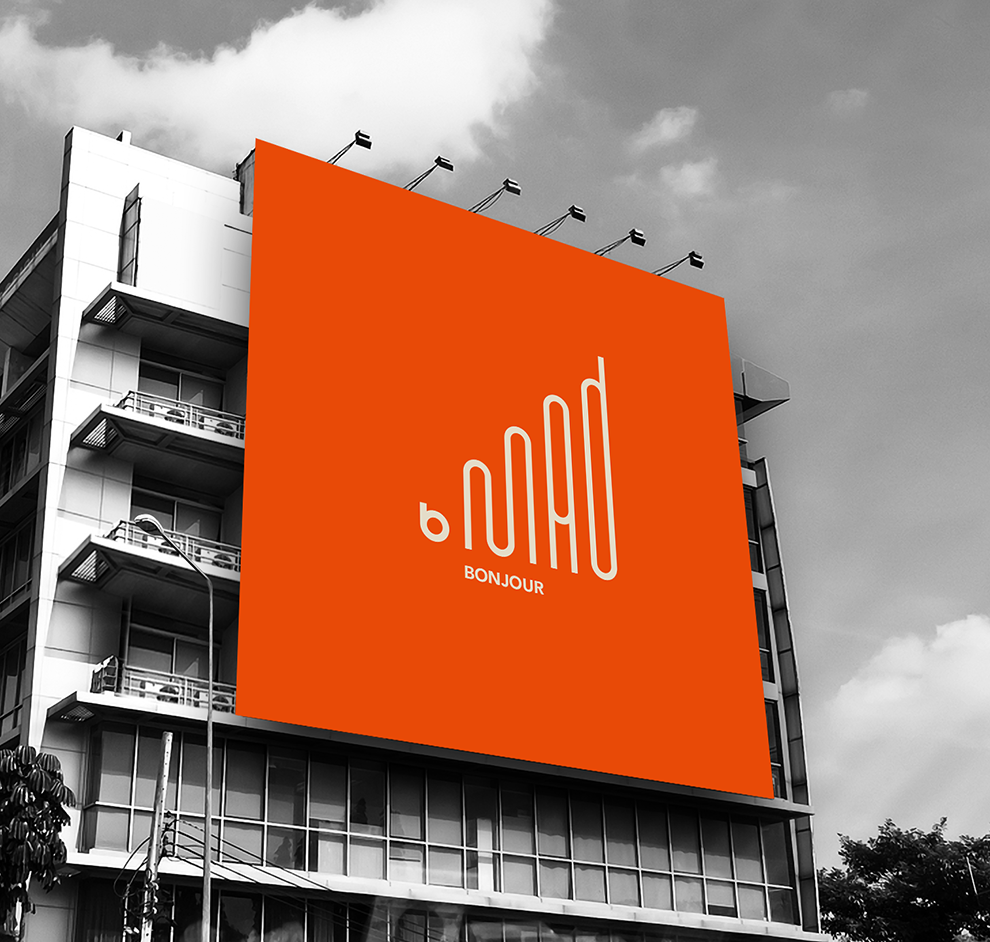
Outdoor advertising
A billboard is a large outdoor advertising structure, typically found in high-traffic areas such as alongside busy roads. Billboards present large advertisements to passing pedestrians and drivers. They work best with clear, concise messaging, as the people who are viewing it are on the move. Typically showing witty slogans and distinctive visuals, billboards are highly visible in the top designated market areas.
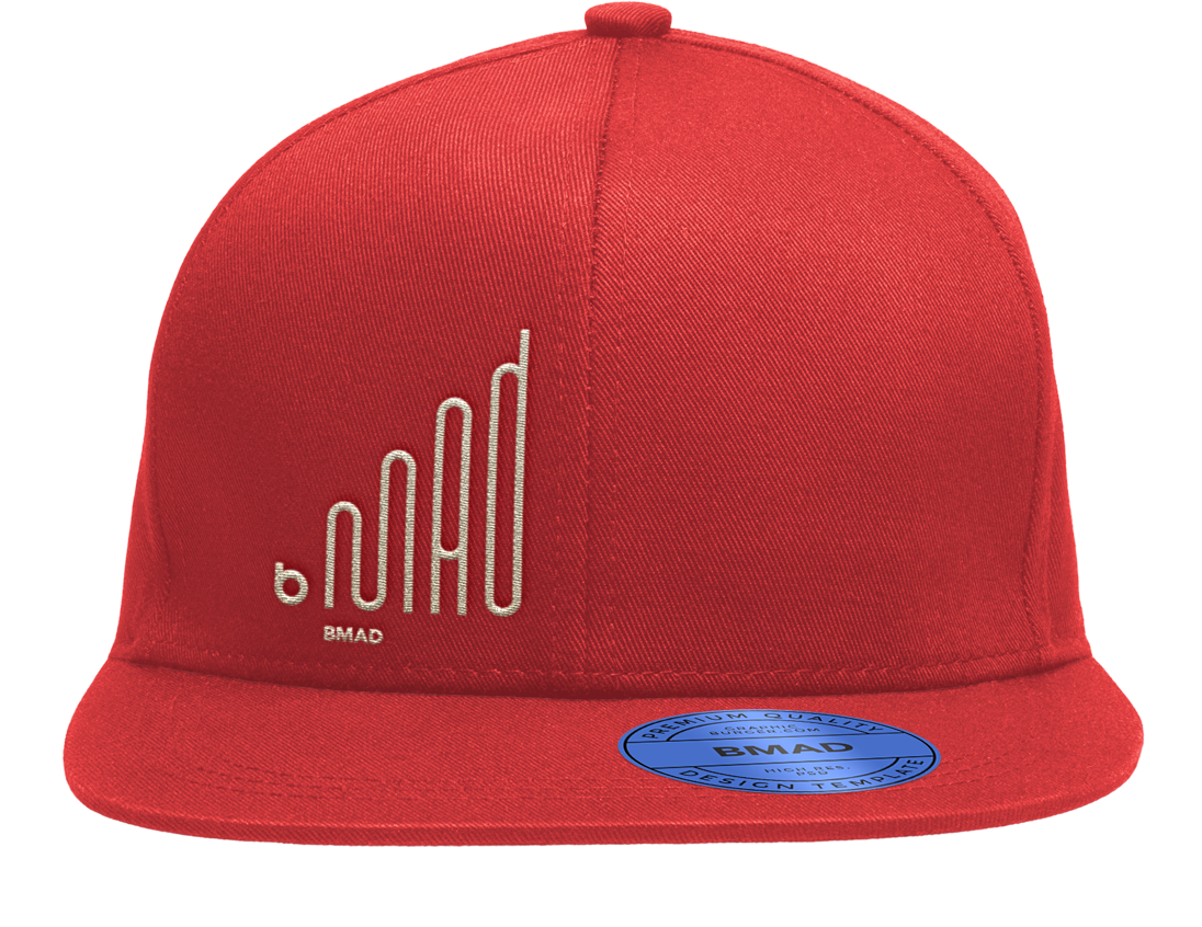
Apparel. Cap
A snapback is a flat-billed adjustable cap that is typically worn by today’s youth. It is an accessory that can go with most styles of streetwear. Hats can be a symbol of style and culture, but they are mostly used for the purpose of keeping cool on sunny day. Hats with embroidery say something a person and can start up a conversation.
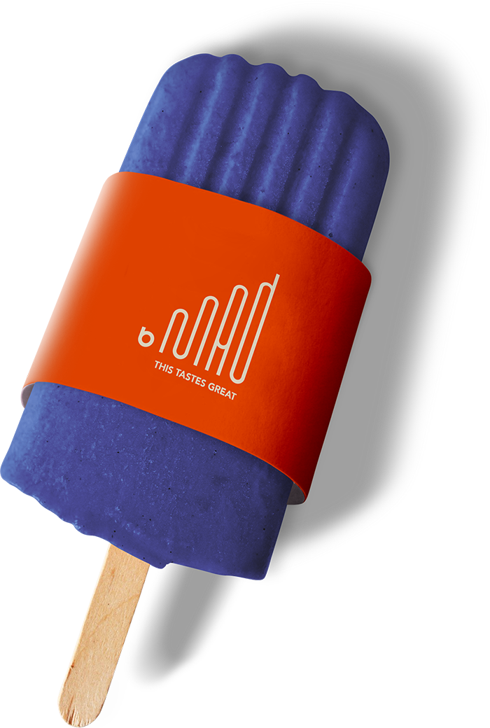
Promotional item
A popsicle with a branded sleeve can be handed out at any place as a way to show support on a smaller and more personal level.
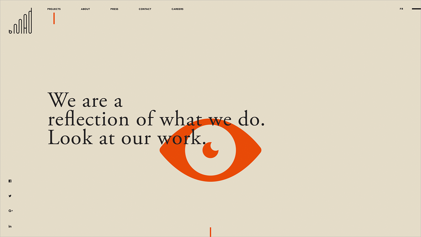
Website
Loader (entering the site)
a. Will be shown to user when access any of the site pages first time. The internal navigation will use different loading overlay.
b. The svg logo will be animated.
Home page (top section template for all pages)
a. When the loader has removed, all the page content are static except the outer part of the eye, that moves relatively to cursor, opposite to the cursor movement and animated bottom line that gives the clue to user about existence of the more content.
b. On scroll the inner part of the eye will start to follow the cursor (div).
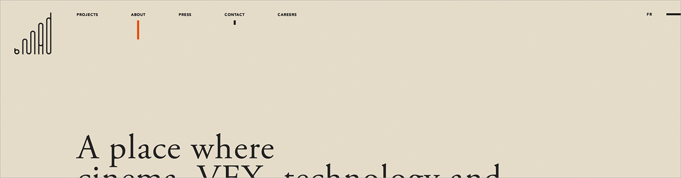
Top navigation
Before scroll.
Current tab will have orange line. Other tabs on hover will have animated down, vertical, dark line smaller than the orange line.
Start scroll.
The tabs values will be hidden. Instead will be shown short lines. Dark lines will be animated from the top (top of the line). Orange line height will be reduced. Orange line will be slightly longer than the dark lines.
Hover navigation block.
When hovering the nav block the tab values will be shown and dark lines removed. Such a small detail can change a lot I think :)
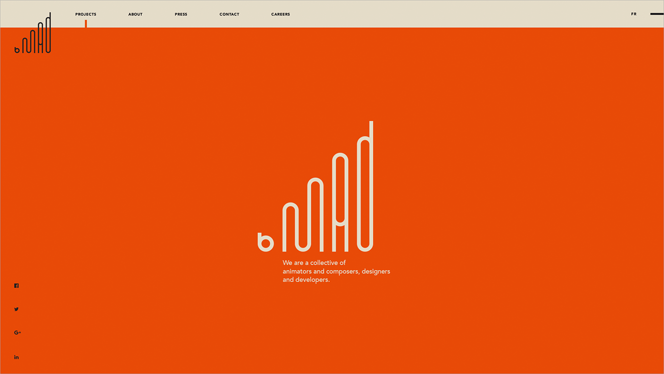
Footer
This is just an idea. The orange area can become a container for anything - message, animation, art and more. The experience begin with the loading orange screen and ends with the orange footer. Beginning = End.
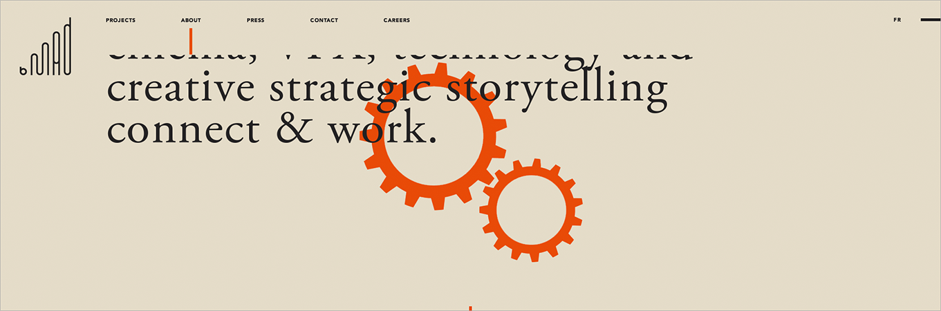
About page
a. Gears will move. The moving speed will be related to the cursor movement speed - faster cursor moves, faster gears turn around.
b. On scroll the small gear will start to follow the cursor, again here the speed related to the cursor movement speed.
About page main content area shows how the text sections will be organized. The example of how will be organized images and following text can be found above.
Thanks for
joining me in this journey
all the way down.
Maxim Aginsky. October 2018
P.S.
Before I have organized the materials for publication on WebTalkTo, all the information - text and images, were located in one very long image, which I have published on my Log - "BMAD. Brand identity manual".
Comparing two publications or better to say two different formats of the same publication I have came to conclusion that the information better presented when it is an image. That will probably lead me to find better way of presenting information on my portfolio, in other words this is a new beginning, in other words this is a new design version.