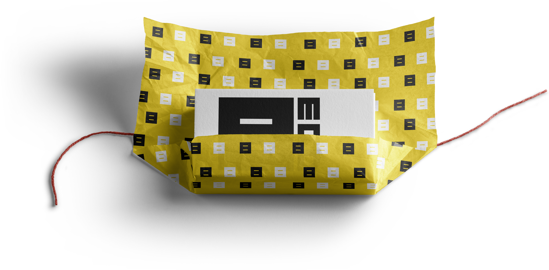
“The crown”. BMAD branding. Alternative versions
It really was not part of my original plan to have so many versions of this Brand Identity. However the process was so emotional that I decided to publish all the versions of this Brand Identity. I want to believe that emotions are something you can transfer into your creation, at least this is what I think I usually do :) In my opinion any created object (logo for example) communicates with the world mainly on emotional level, the emotions are like soul that was given to object by his creator, god or designer it is quite same for me.
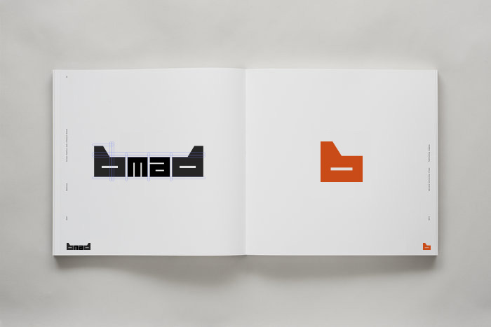
The centre motive of this work can be described in one word – Crown. I tried hard to create shape that visually reminds crown.
How this publication is organized
The most interesting is usually at the end, so I decided to keep descending order of the versions in this publication. It is why some of the things that well explained at the bottom of the page, may not appear again at the top of the page.
Purpose
This publication intended to show the working process on BMAD rebranding from it's start to the final point. The final version of this work is here.
Table of contents:
- Logotype adjustment
- Corporate identity. Fourth version
- Corporate identity. Third version part 2
- Corporate identity. Third version part 1
- Visual identity. Second version
- BMAD visual identity. First version
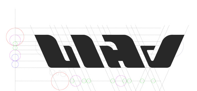
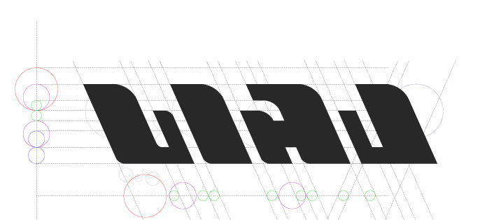
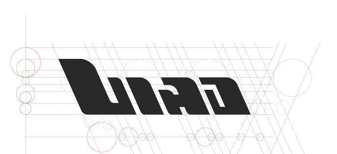
Logotype adjustment
A few more tests before making the final decision.


Corporate identity. Fourth version
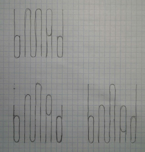
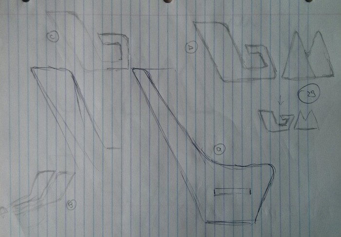
Sketching the new idea.
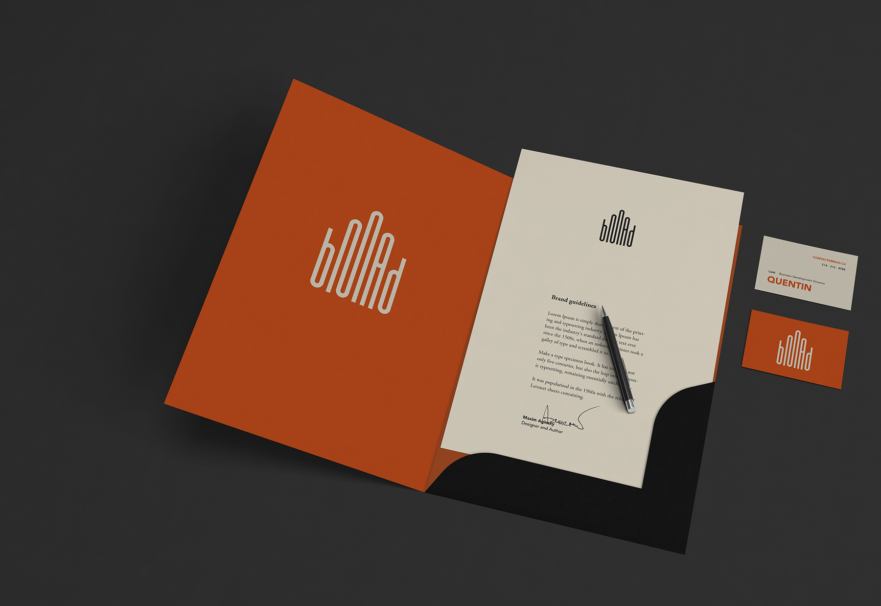
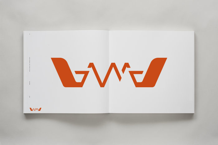
Crown. BMAD logotype.

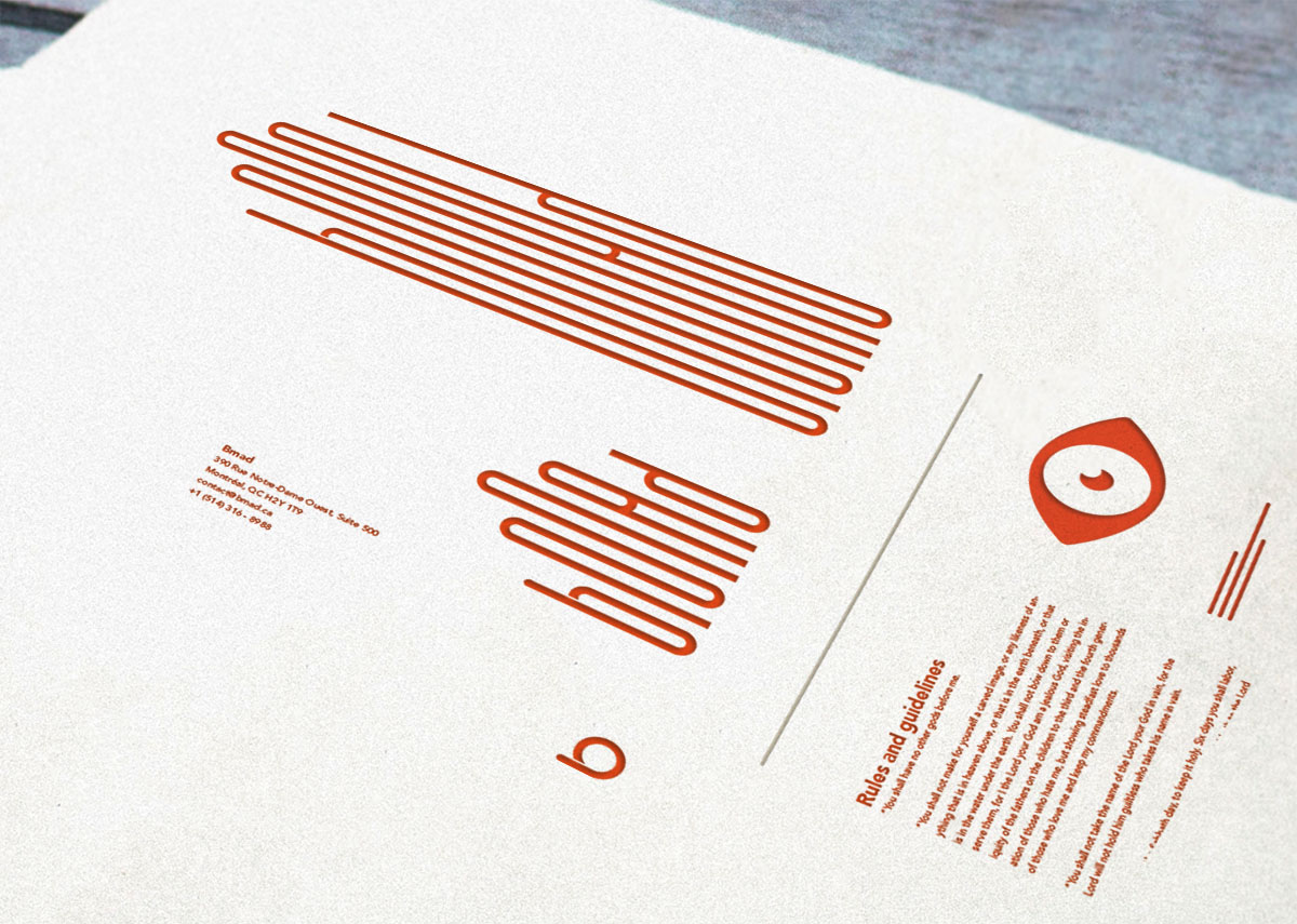
Stationery. Application example.
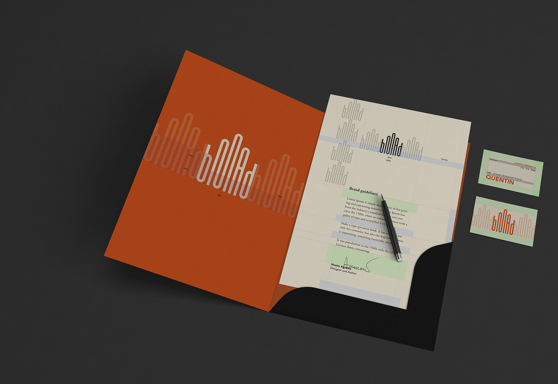
Application rules.
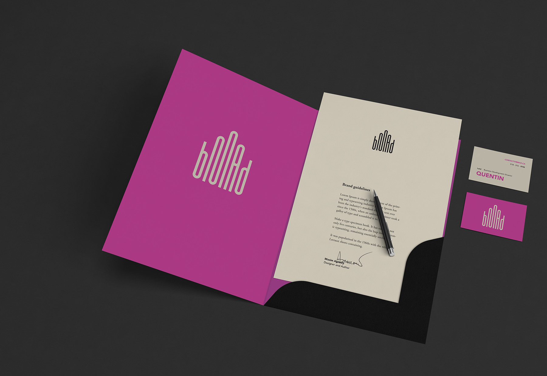
Different color test.
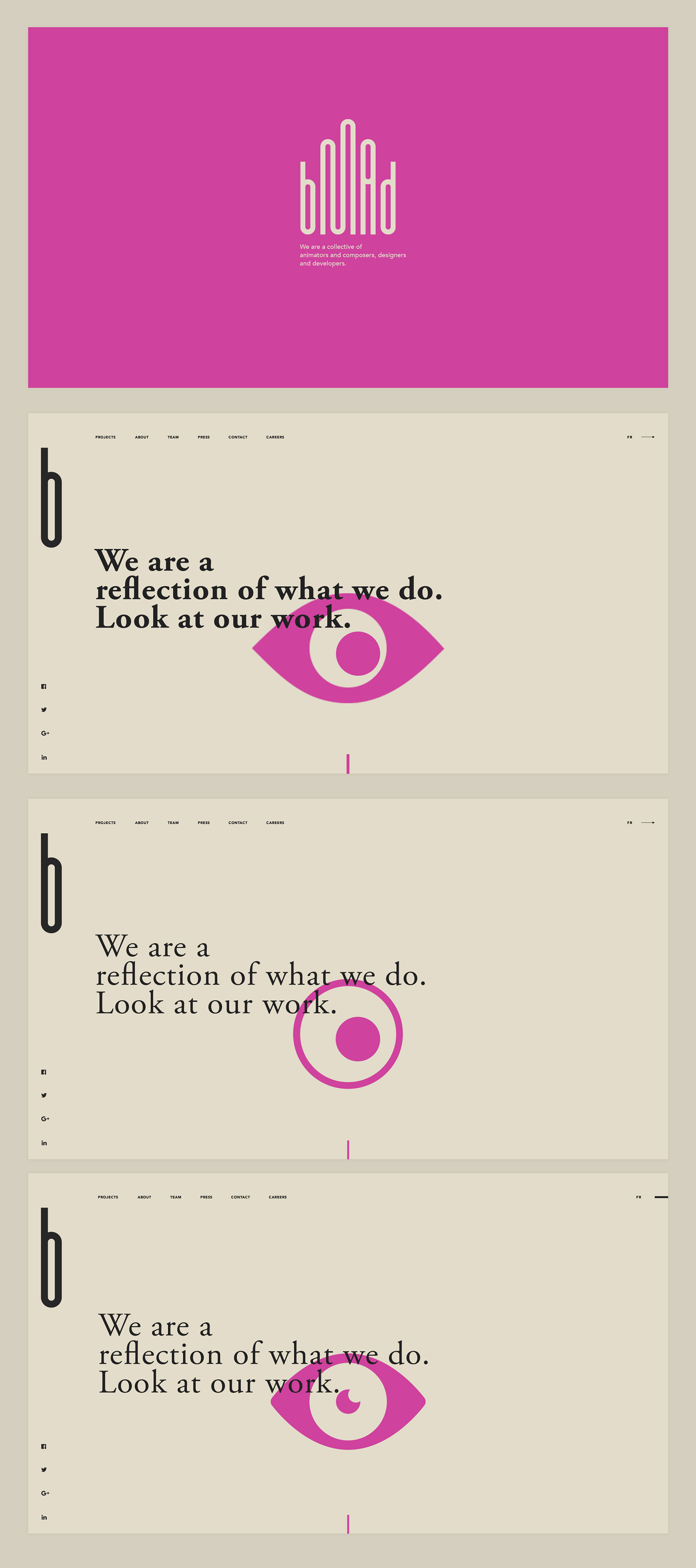
Creating the eye for website home page which should visually illustrate the home page message - “We are a reflection of what we do. Look at our work.”.
Icon tests. This is the first letter of the logotype that will be used for the small size canvases, such as favicons and other small icons.
Comparison with the Hyperlapse.

Logotype alternatives.
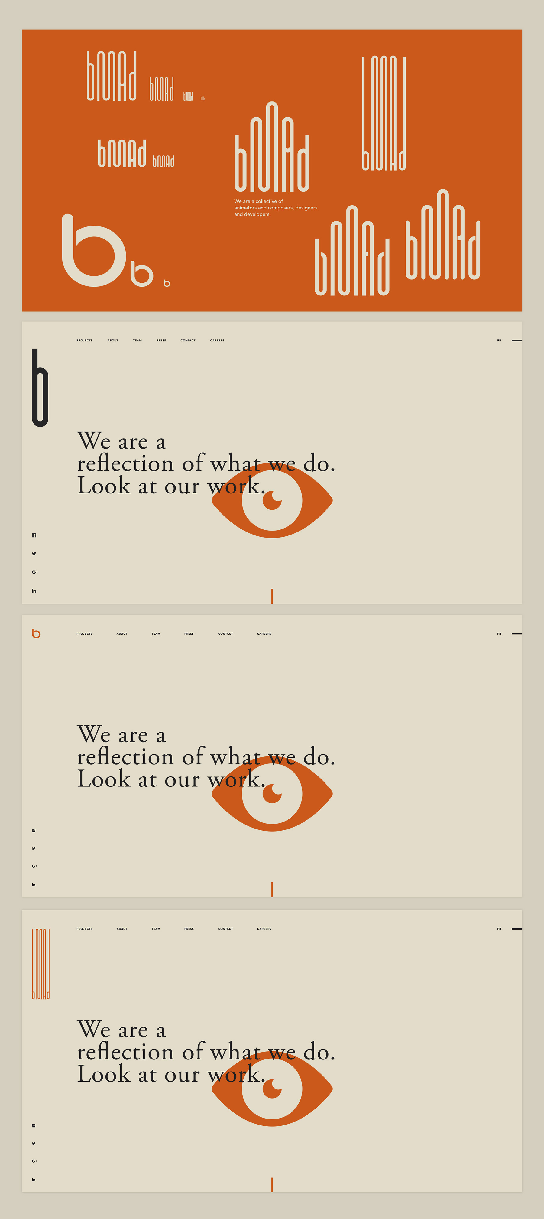
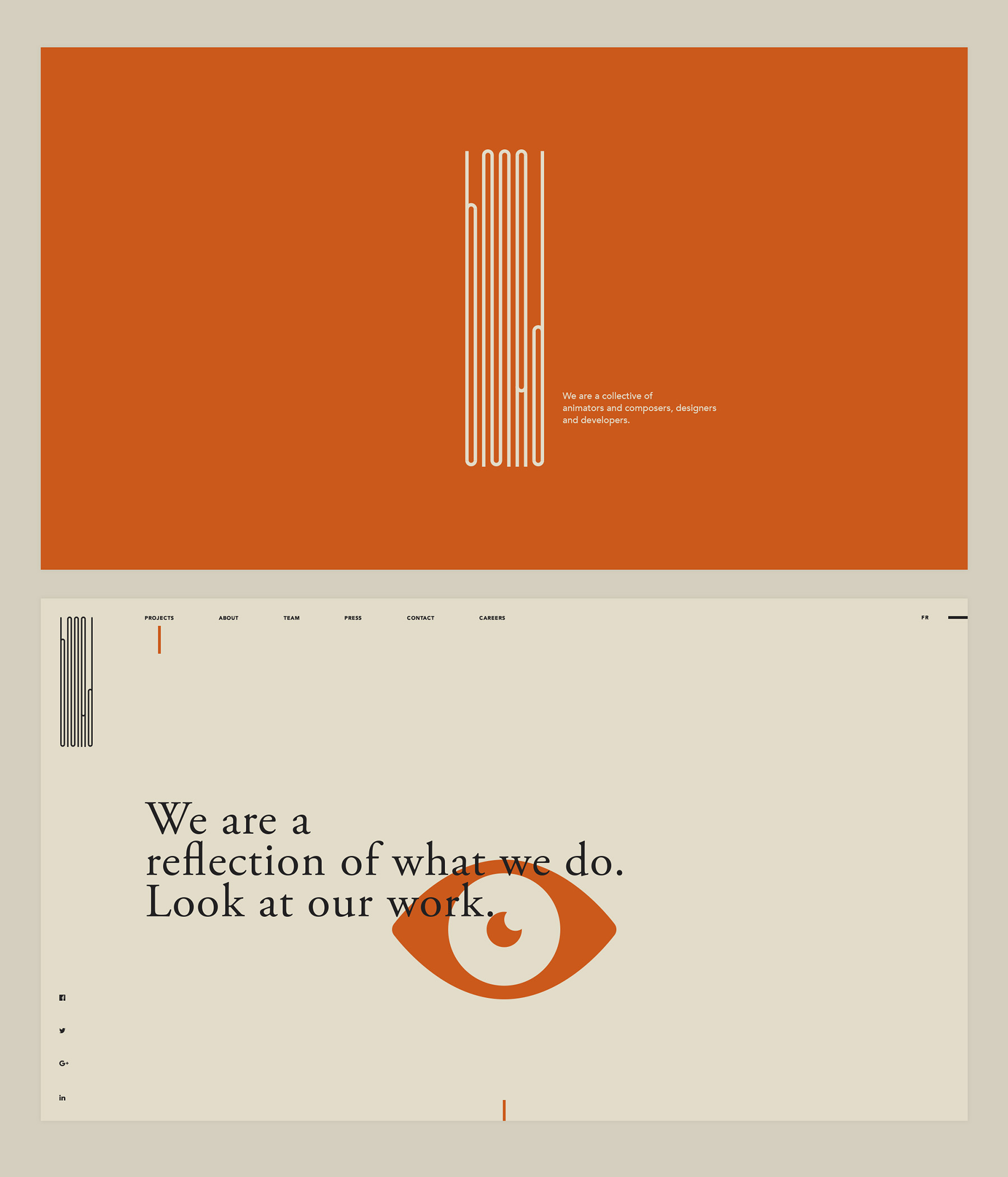
Website home page with one of the alternative logo versions.
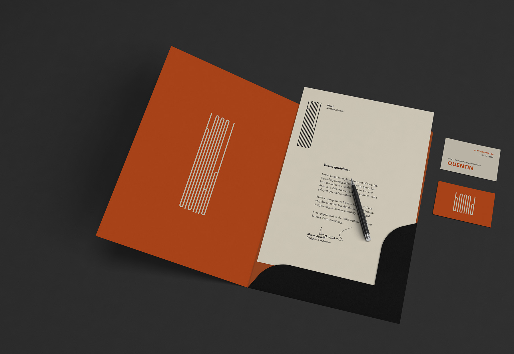
Stationery. Application example with one of the logo alternatives.
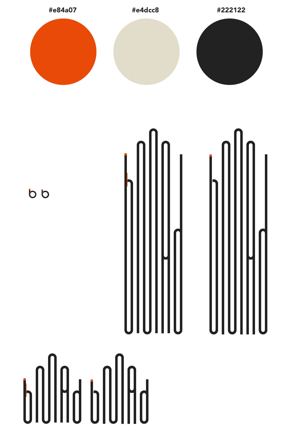
Brand colors and logo alternatives.
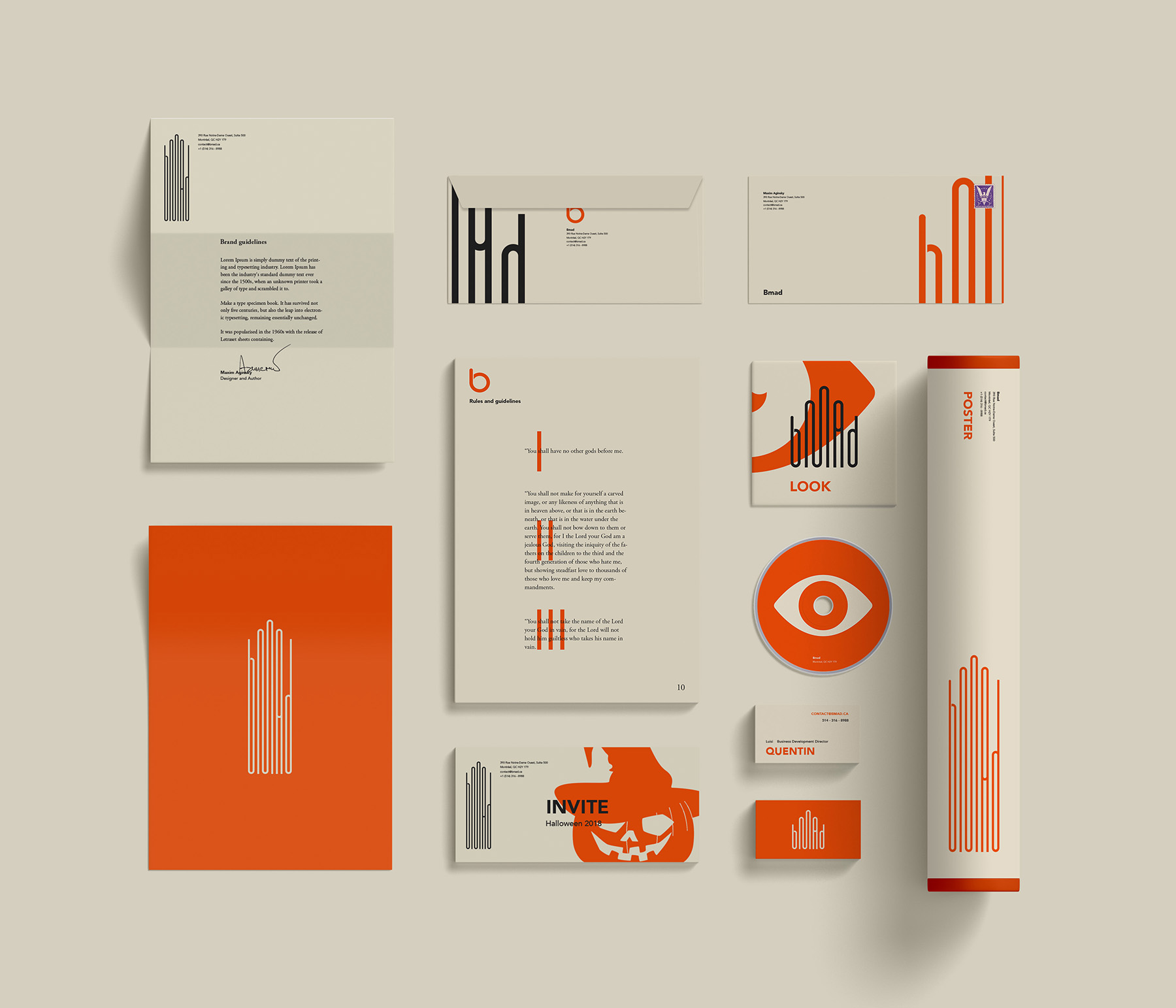
Stationery.
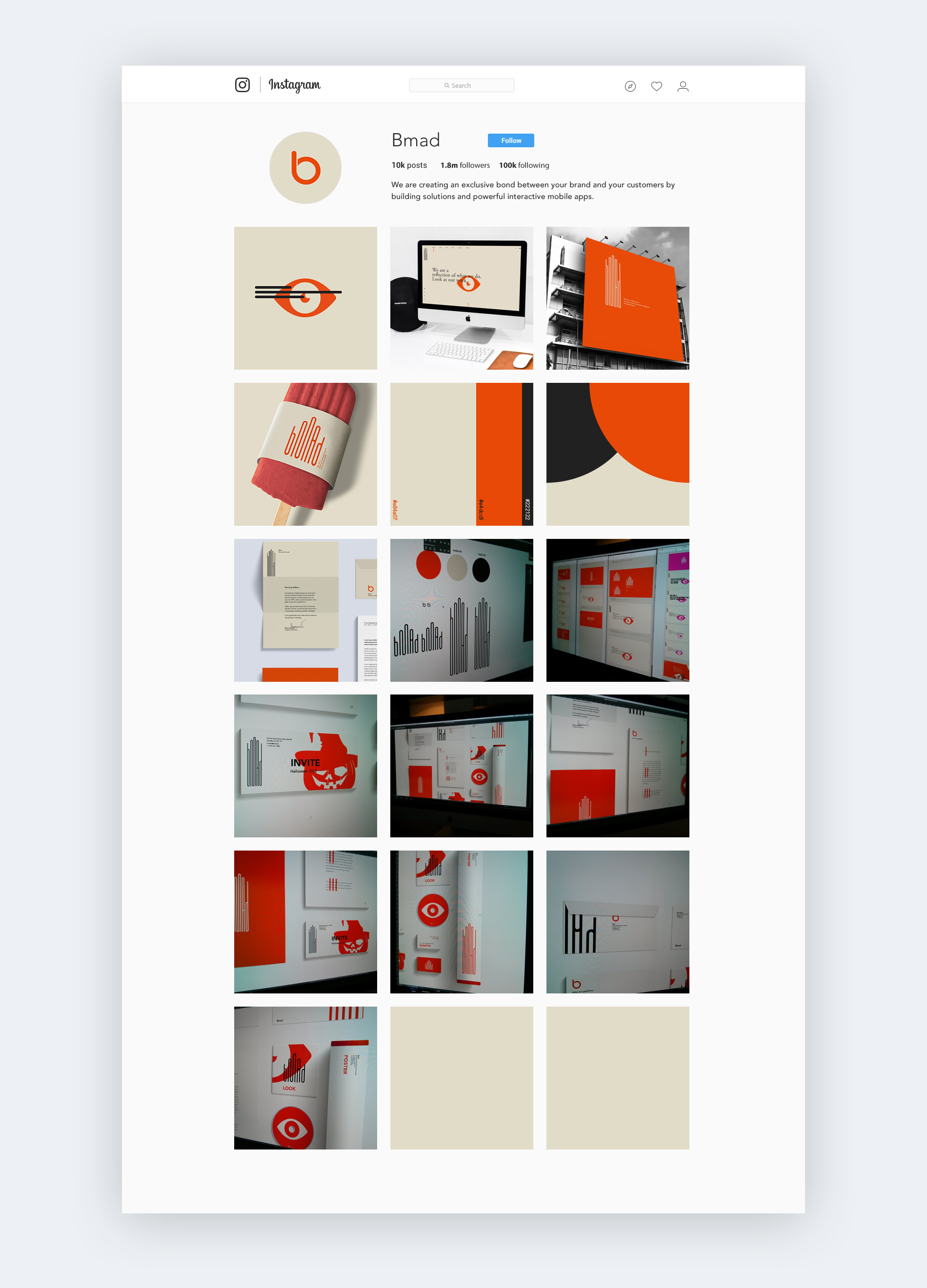
Imaginary BMAD's Instagram page.
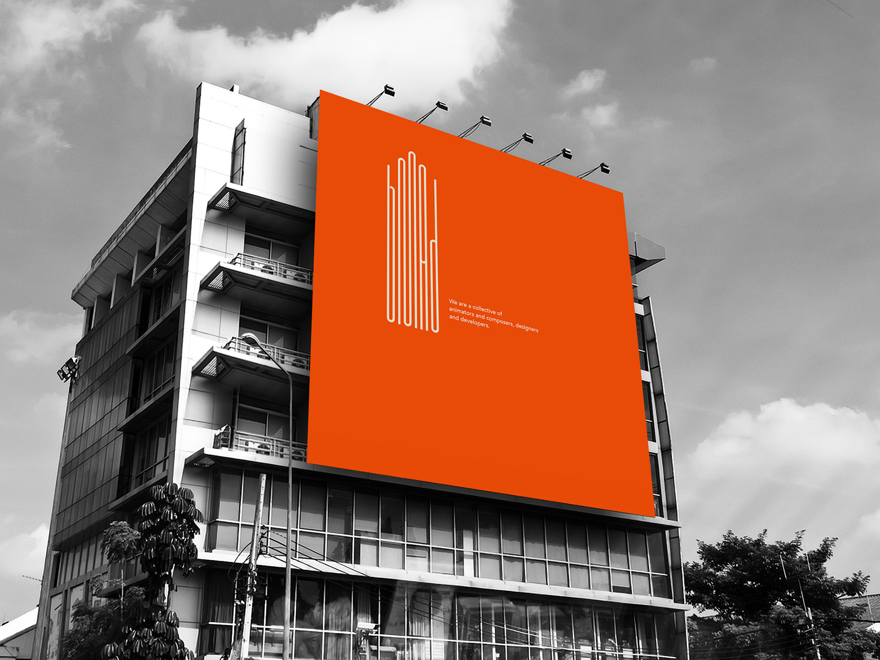
Outdoor advertising.
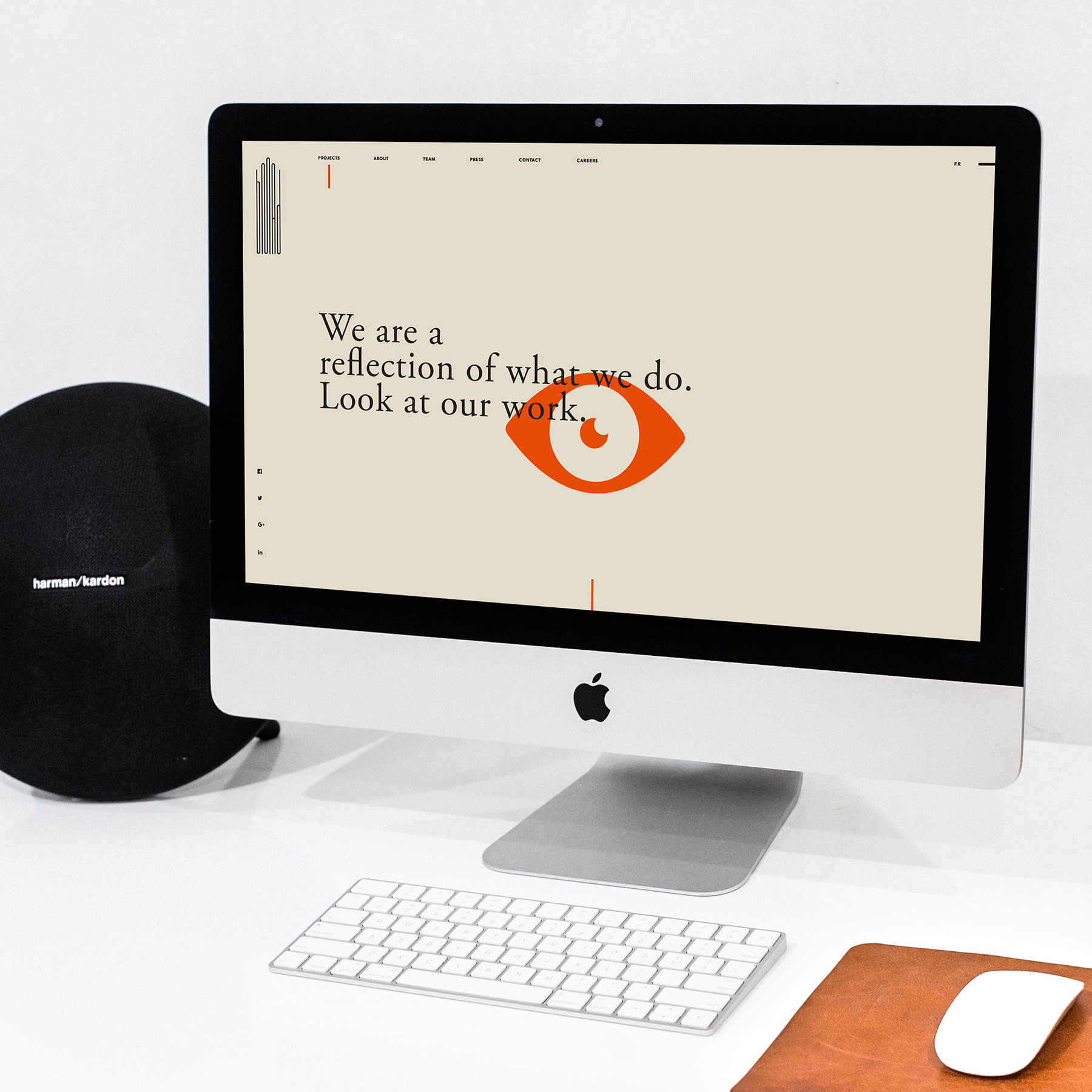
Realistic illustration of the BMAD website home page.
Perspective examples of the logotypes application.
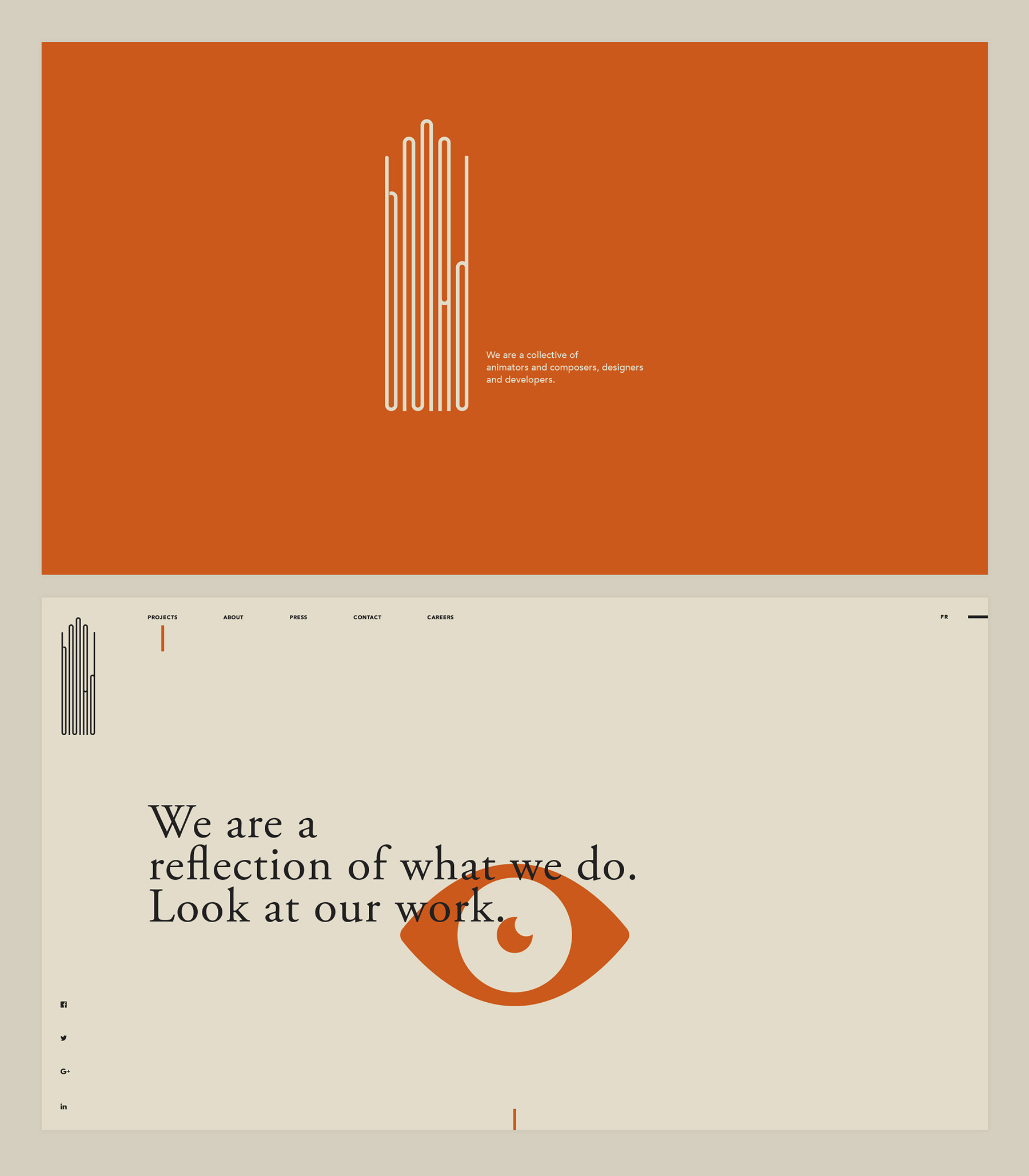
Website home page.
Corporate identity. Third version part 2
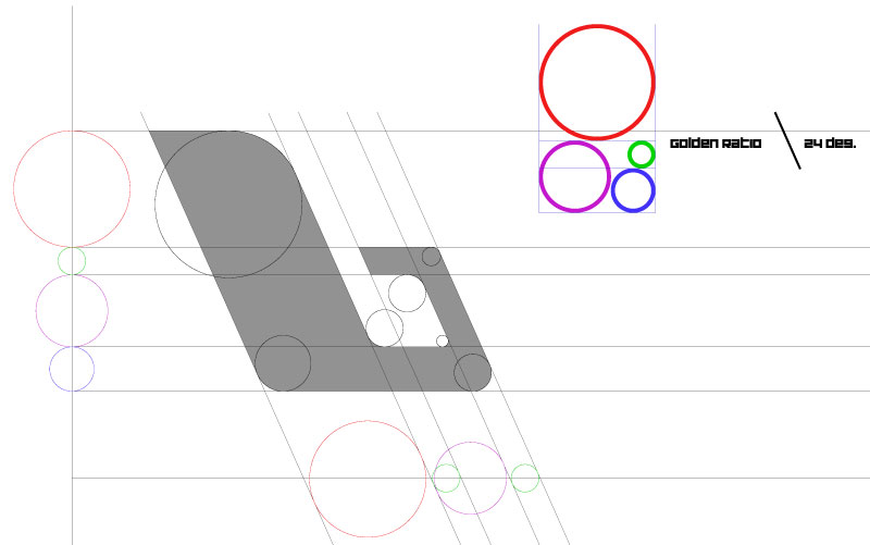
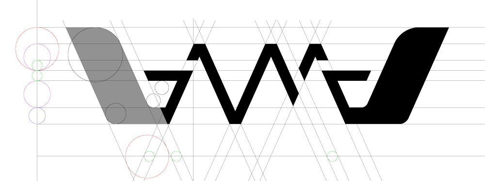
The logotype created with the help of golden ratio rule.

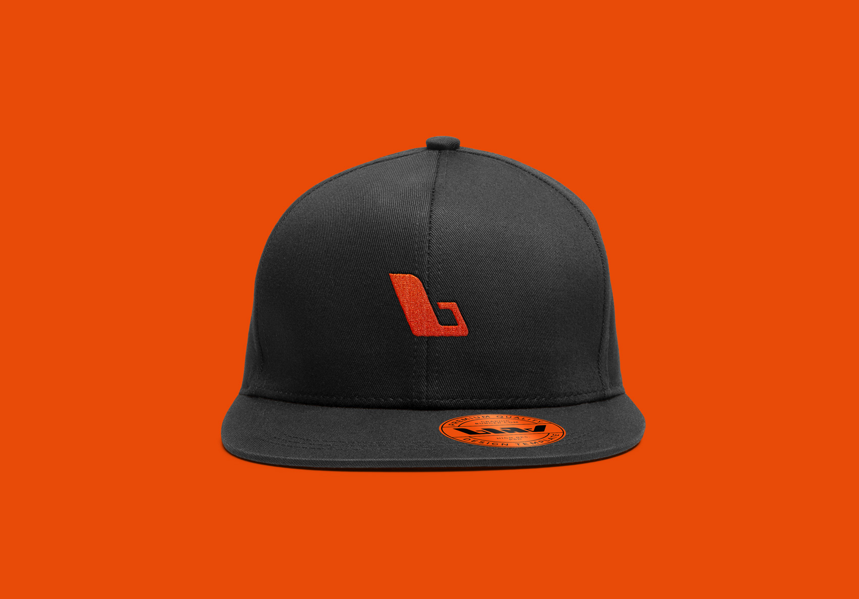
Logomark on hat. Realistic illustration.
Logotype with small modification of the letter "d".

Logotype and logomark on A4,5,6 and business card.
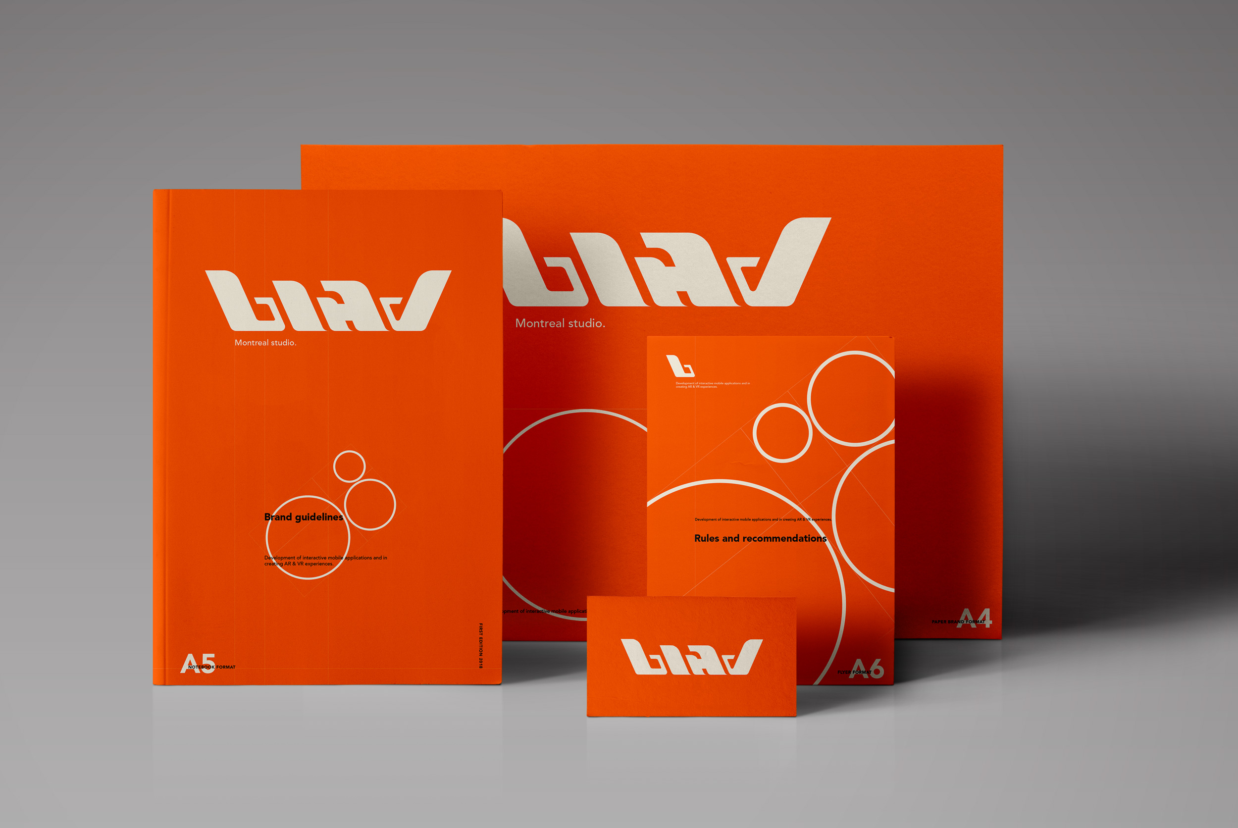
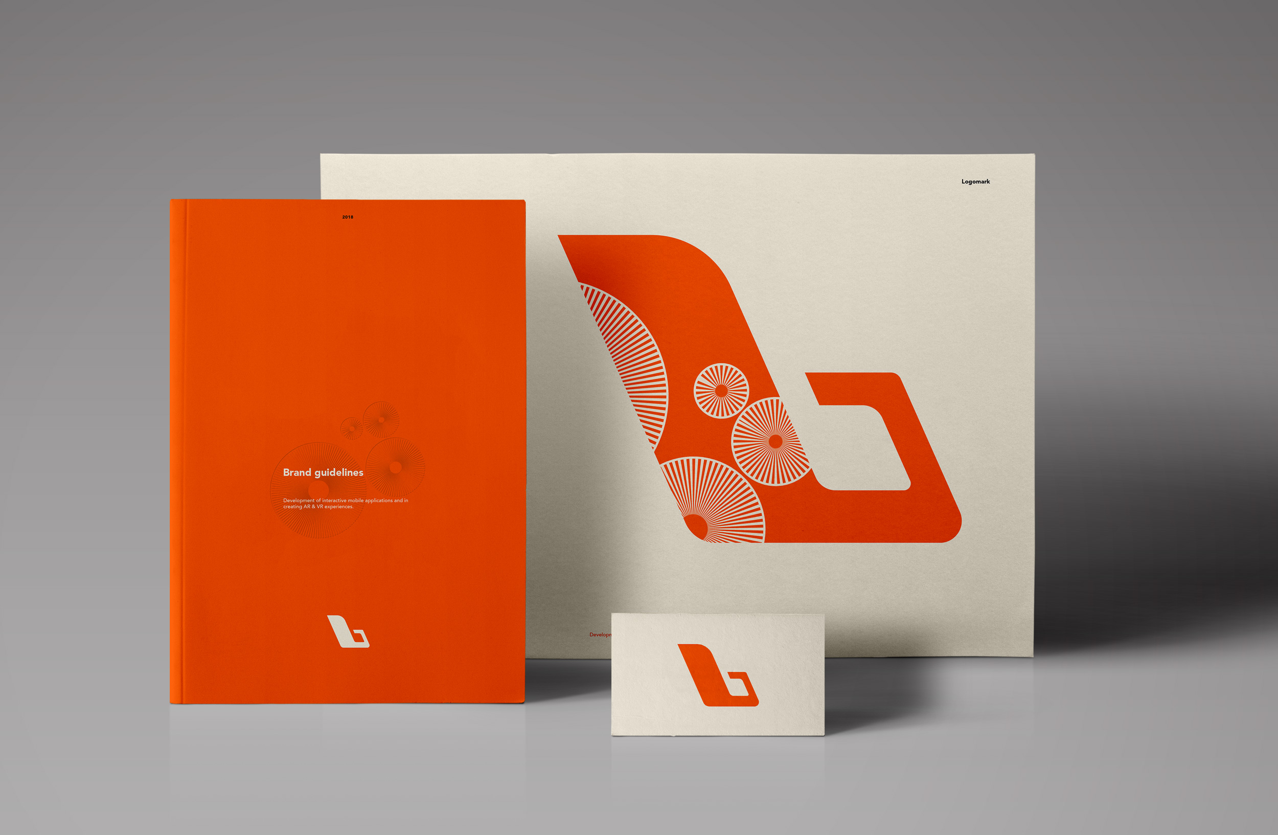
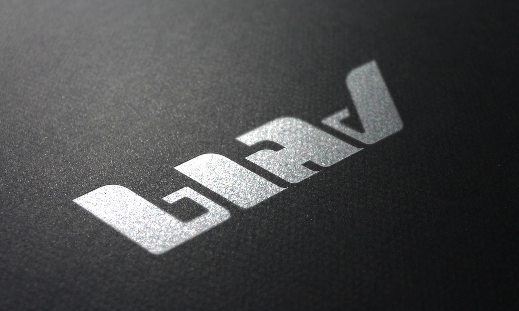

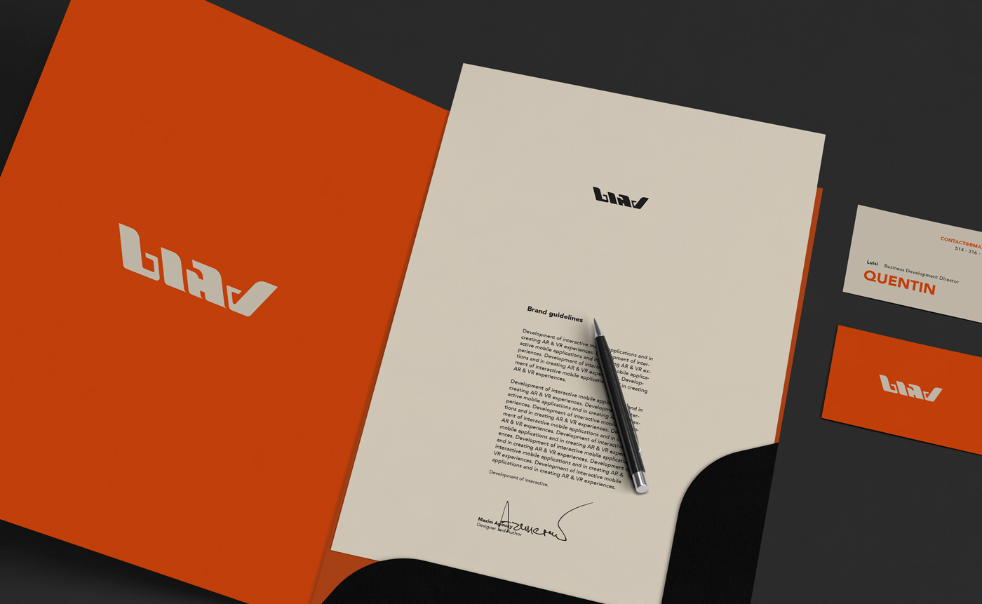
Stationery.
Corporate identity. Third version part 1
Coronate yourself - be mad.
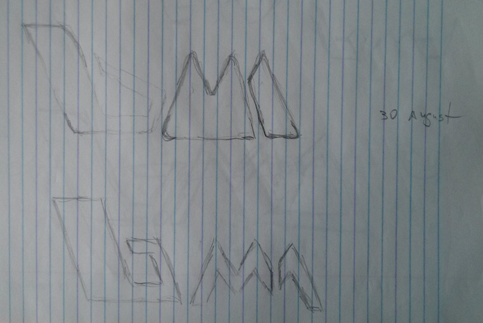
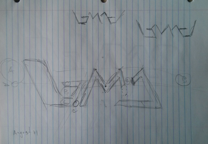
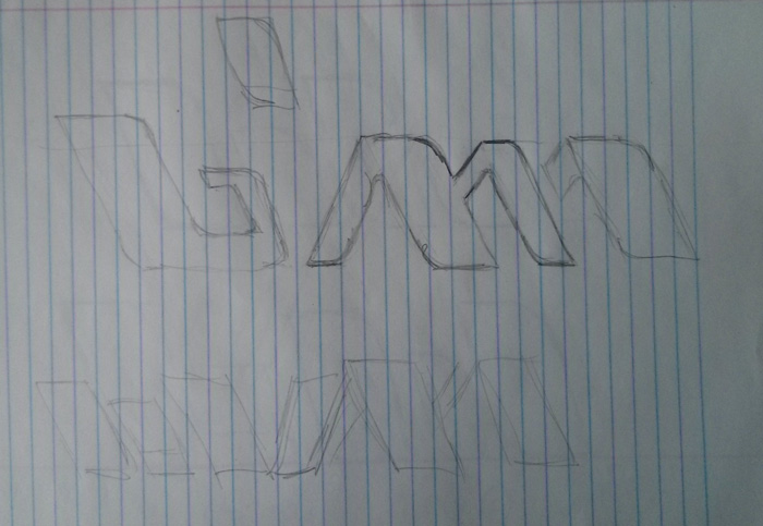
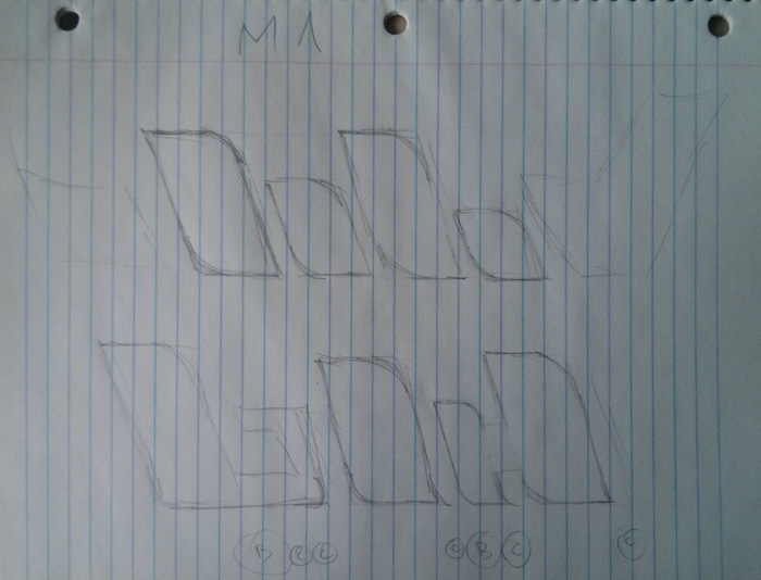
First sketch of the logotype.
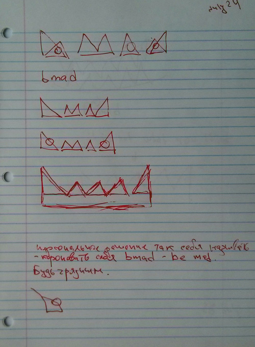
Idea for the website intro animation.
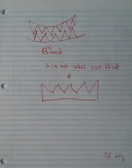
Crown. Second sketch of the logotype
Yes, yes – letter “M” needs to be placed before the letter “A”. Interesting why I made this mistake, probably because at this stage it is not really important – M = 2A.
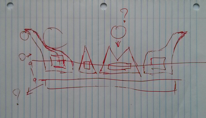
Bmad – this is just great!

Logotype sketch.
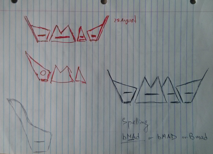
First letter of the logotype.
Logomark. Lowercase letter "b".
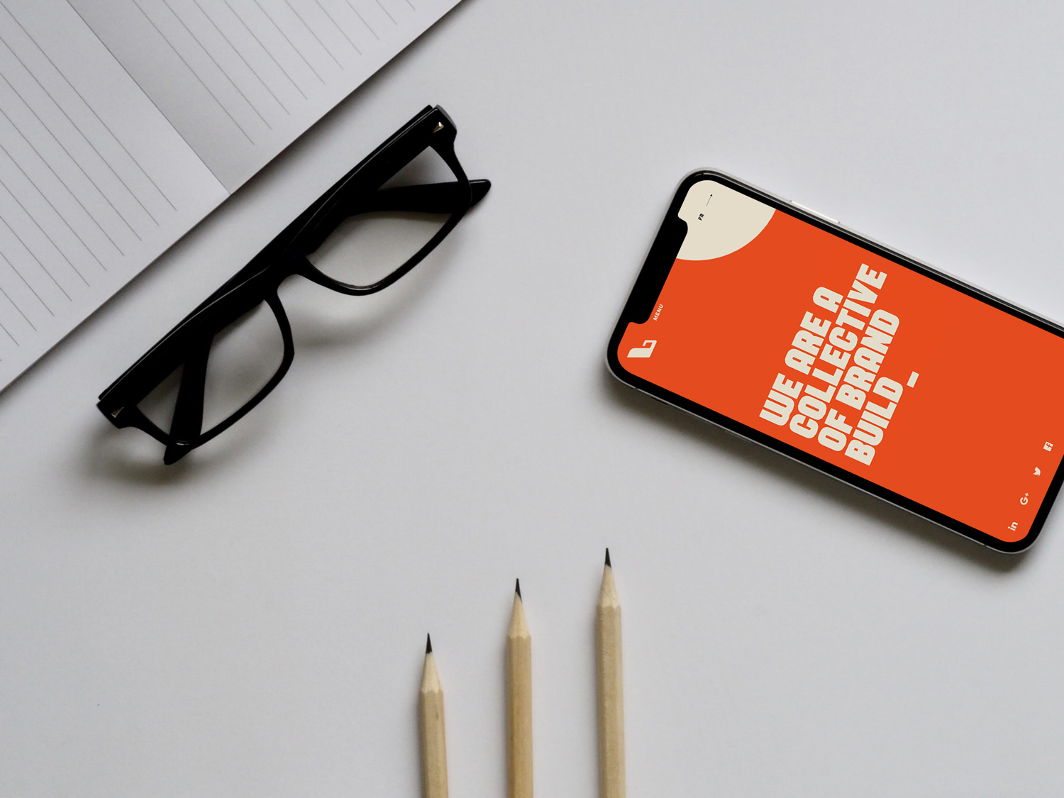
Website home screen on iPhone X.
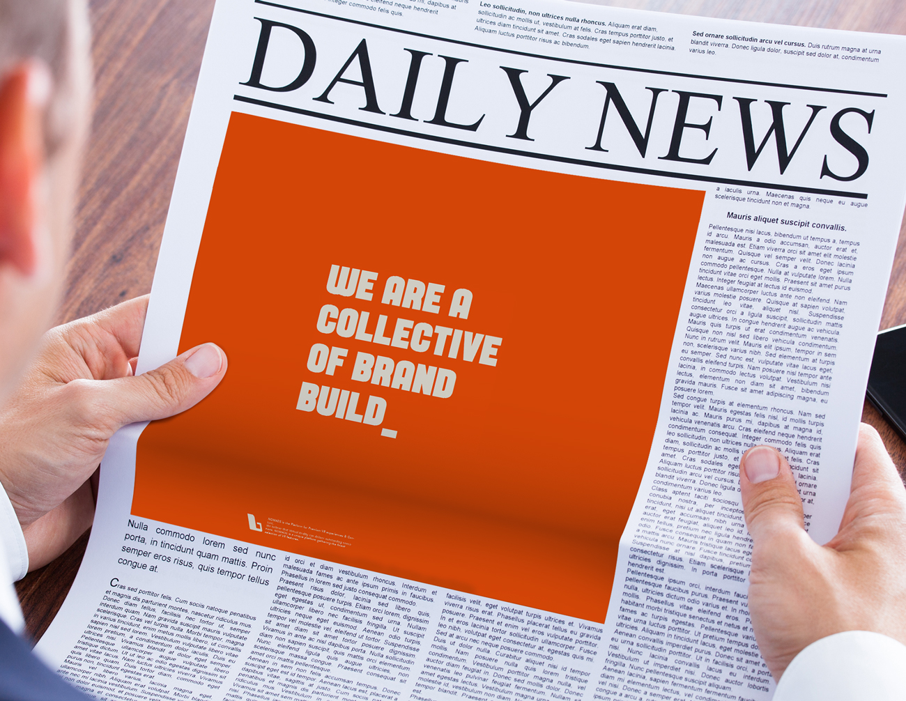
Newspaper ad.
Logotype sketches and realization using Illustrator.

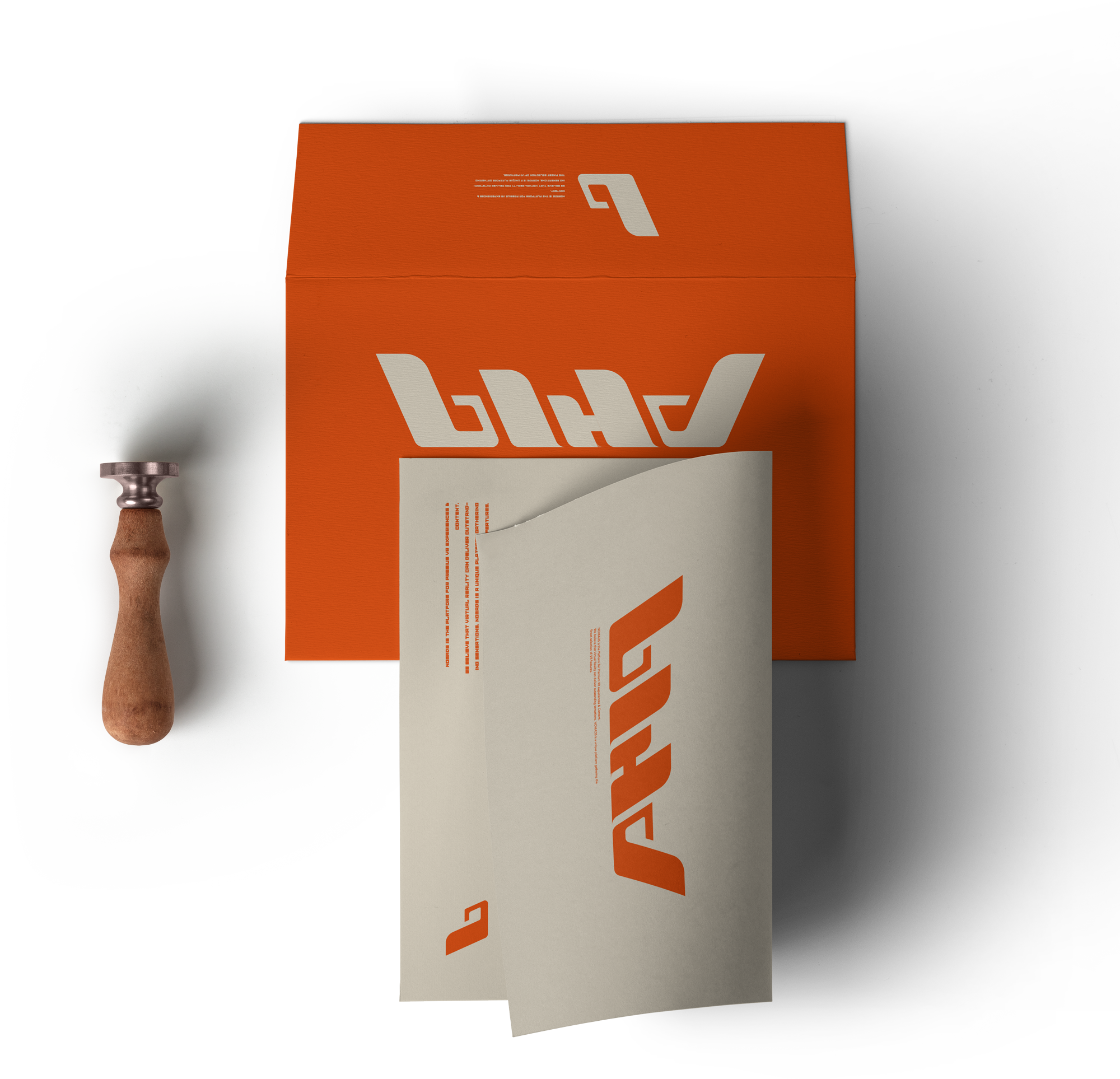
Logomark and logotype on letter and envelope.
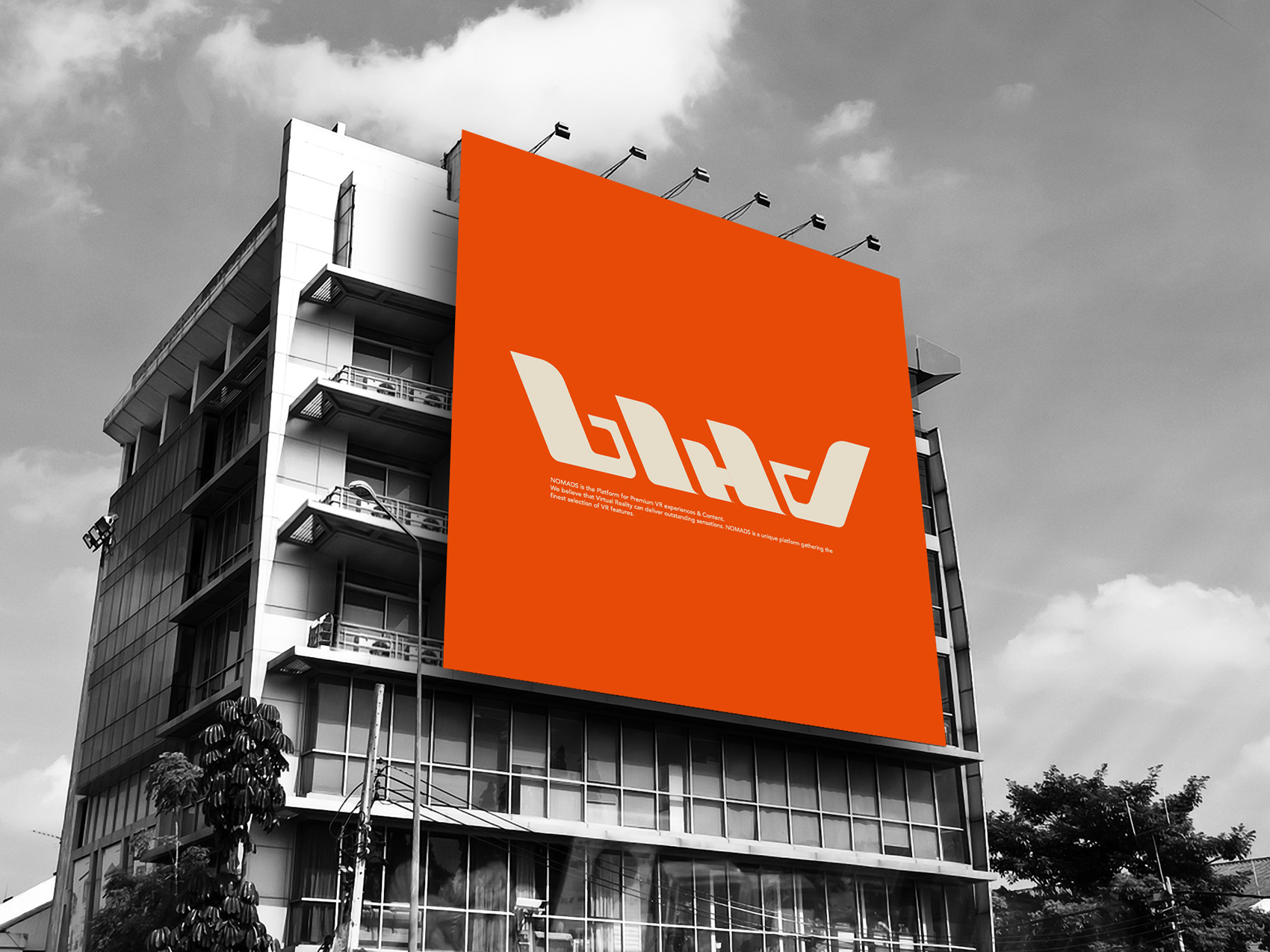
Outdoor advertising building billboard.
Website intro.
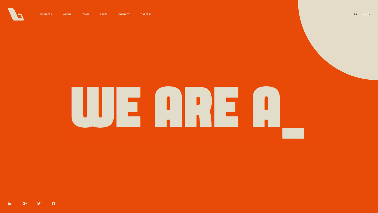
Website Home page.
Projects website page.
Visual identity. Second version
This and the first versions of the identity are based on the usage of the font created by Chequered Ink – UK design studio. The “B” logo is a true letter B of this font. This is a good example of how important can be the right choice of the font type for the brand.
Intro, home and single work website screens. August 24
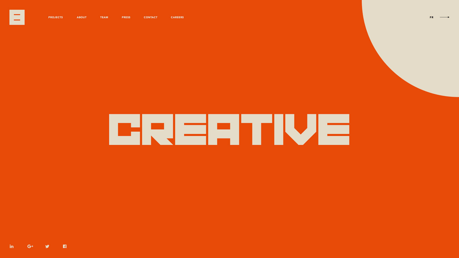
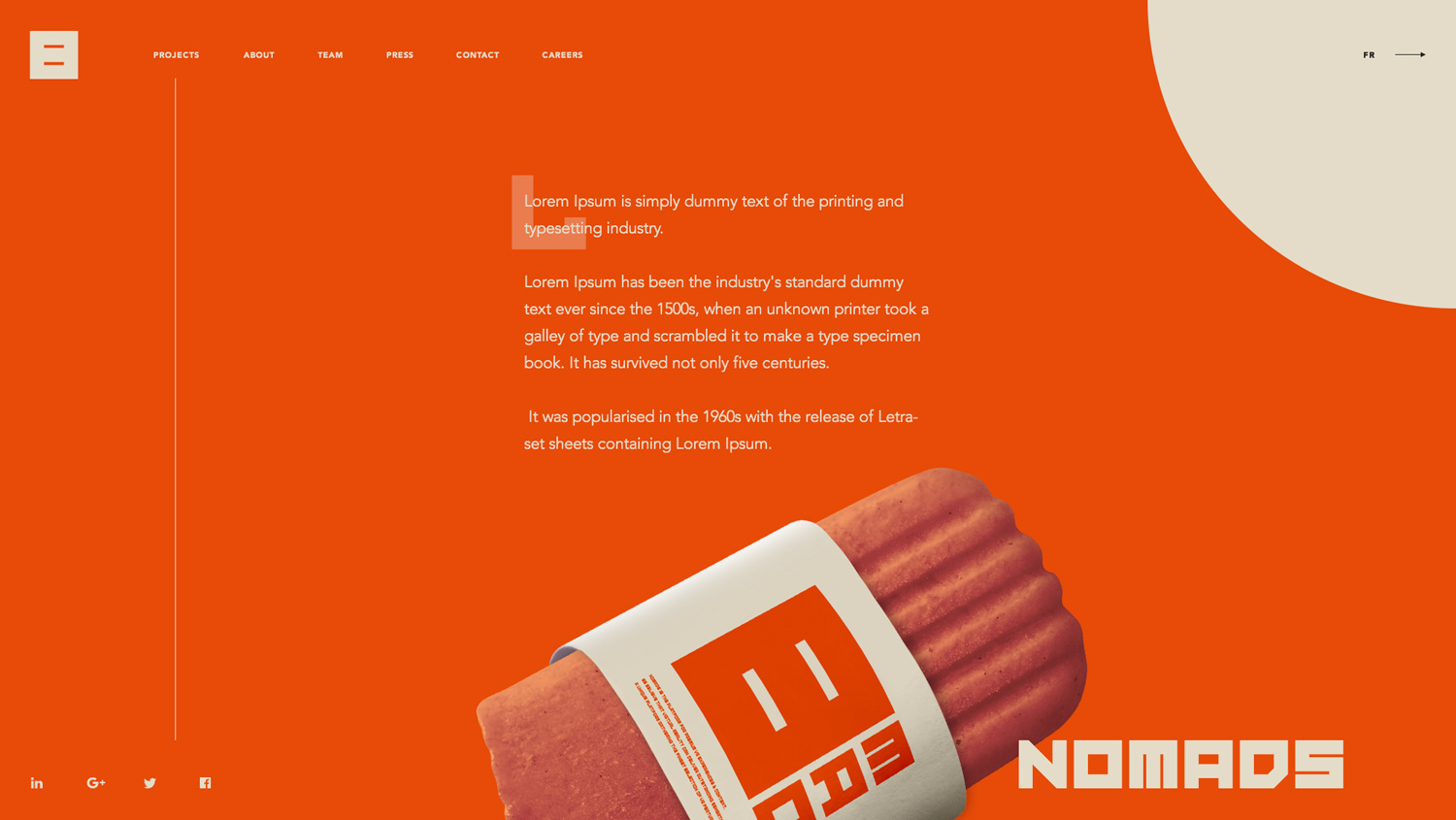
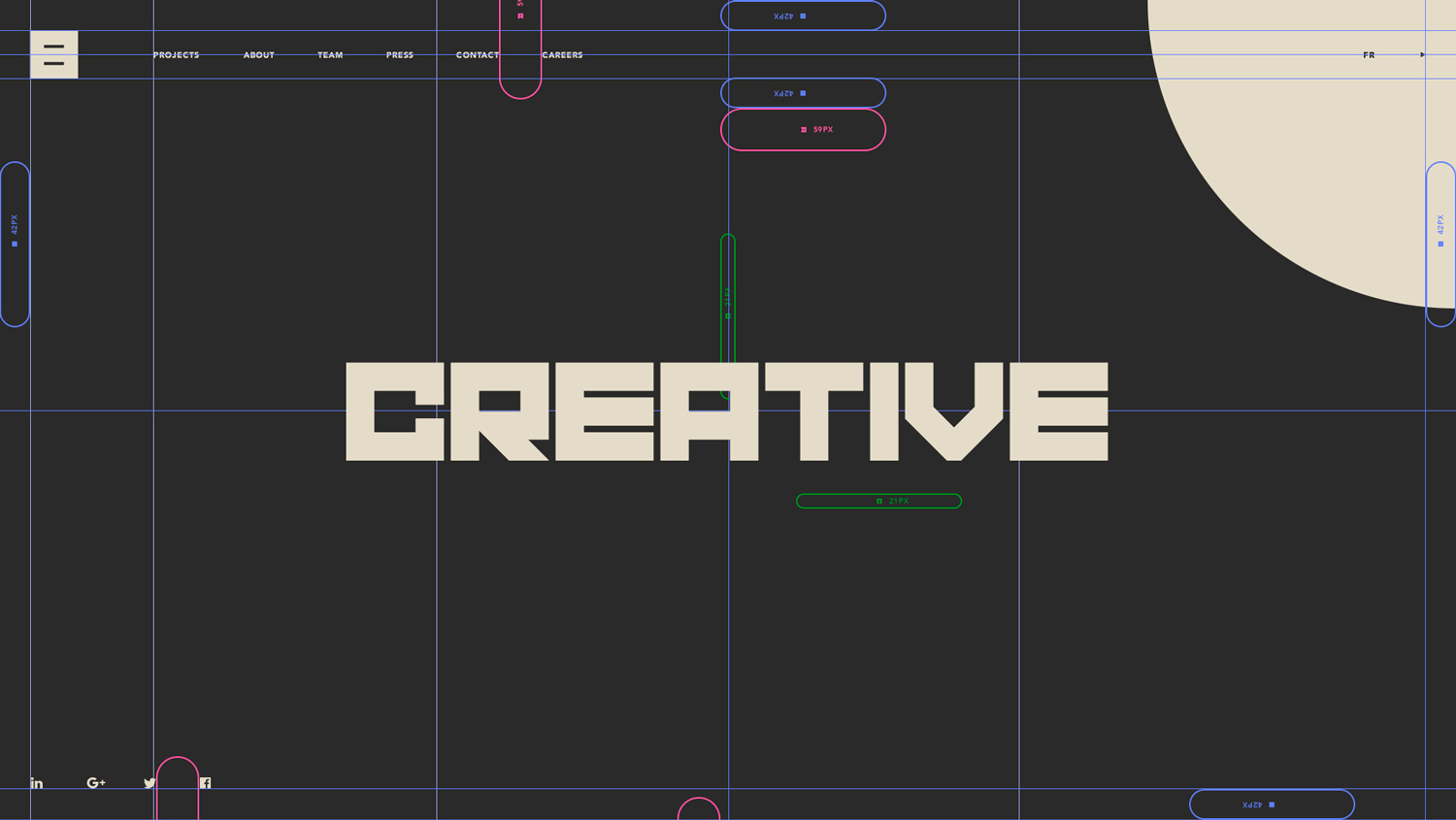
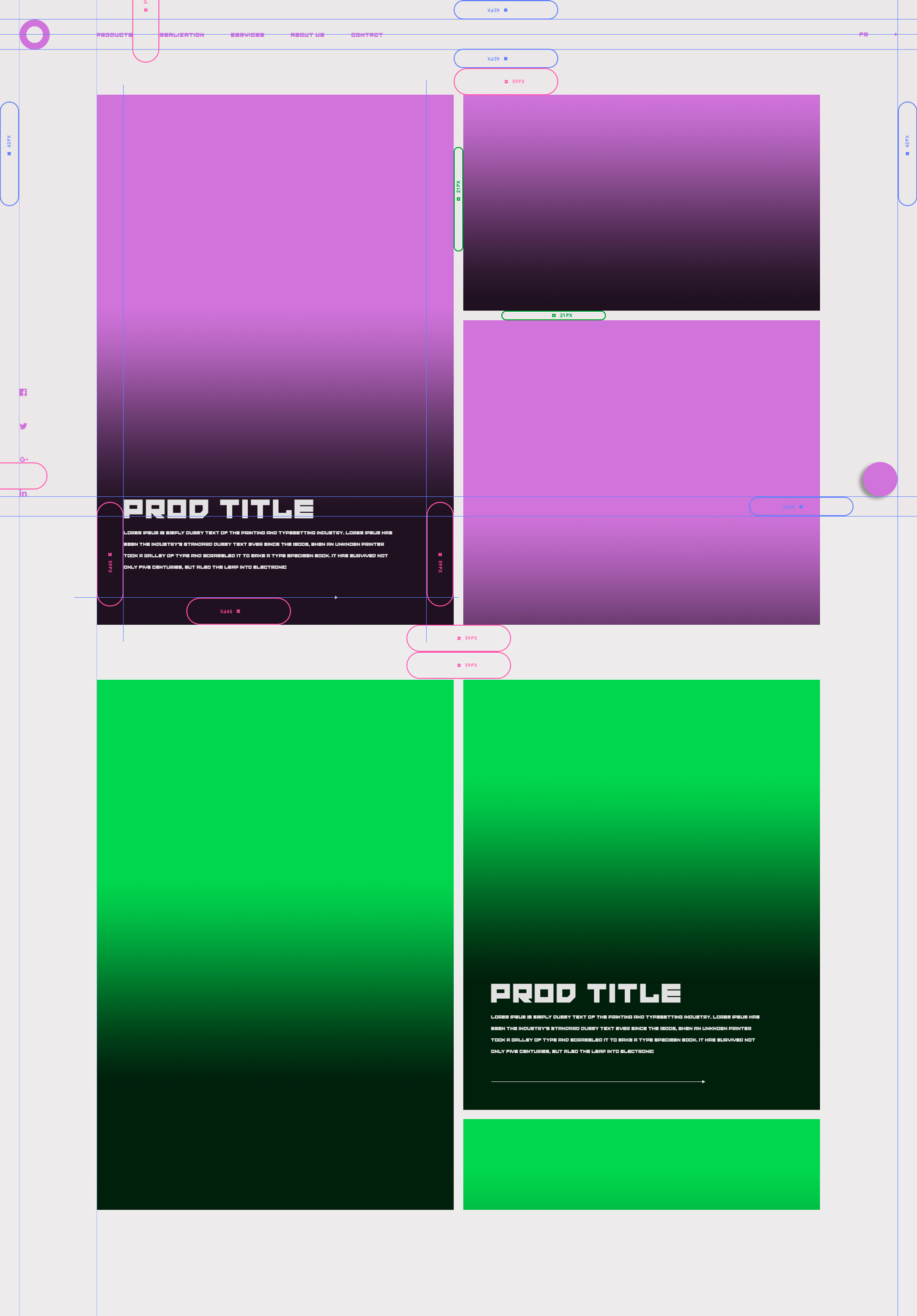
Website home page anatomy.
Icon and logotype on letter and envelope.
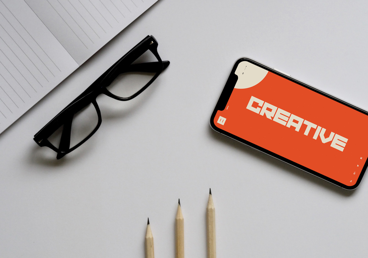
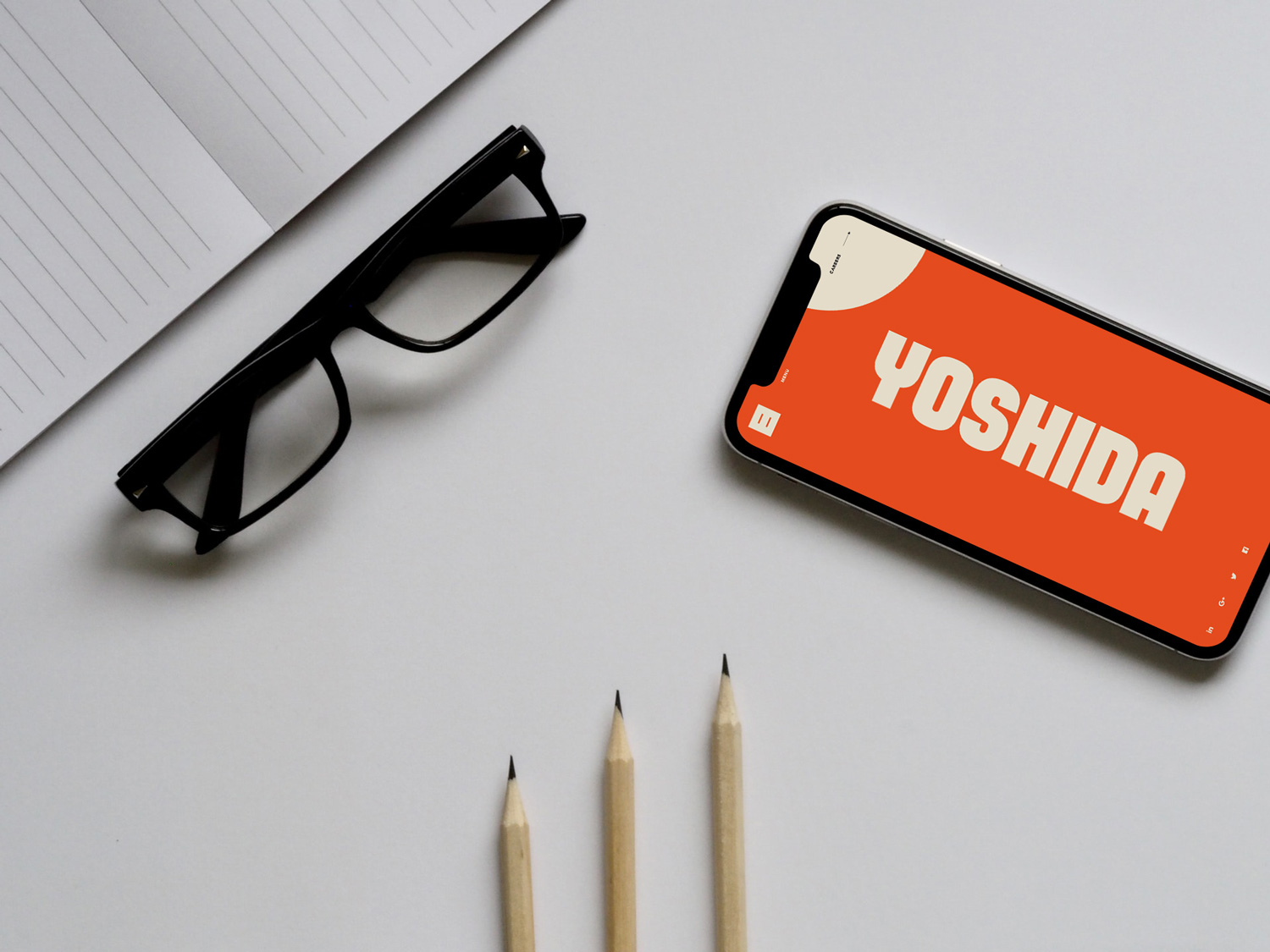
Website home screen on iPhone X, plus my best tools – pencil and paper. In a few more years the glasses will probably join the best tools set. Hohoho...
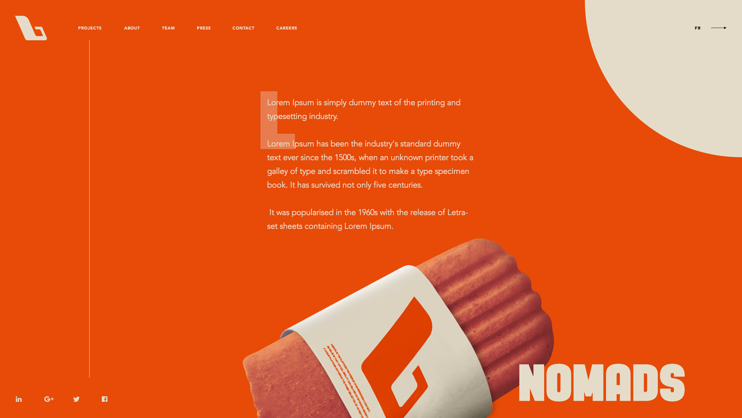
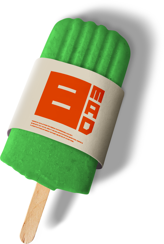
A popsicle with a branded sleeve. If you need to be mad about something, just think about it while eating this special popsicle.
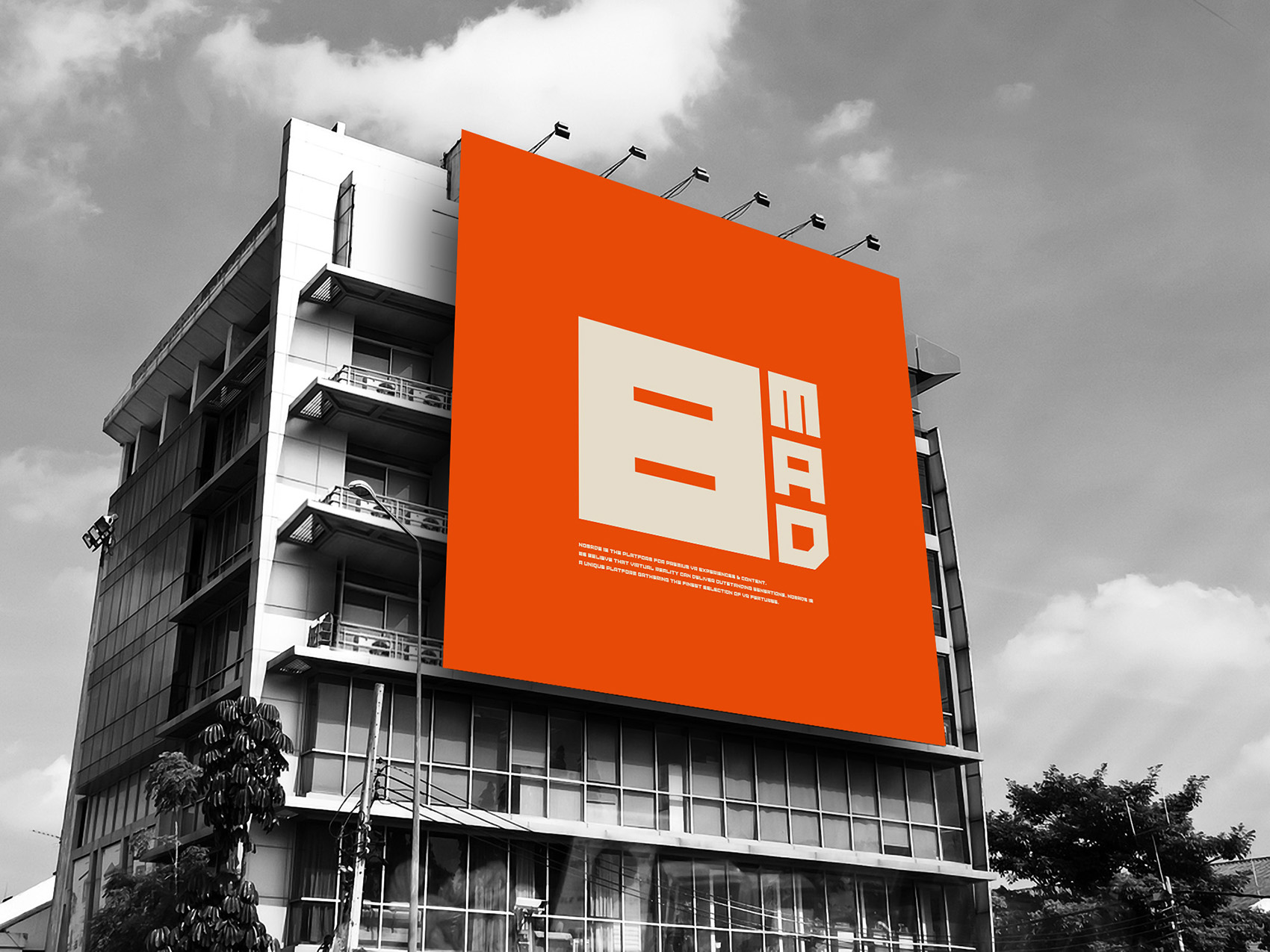
Outdoor Advertising Building Billboard.
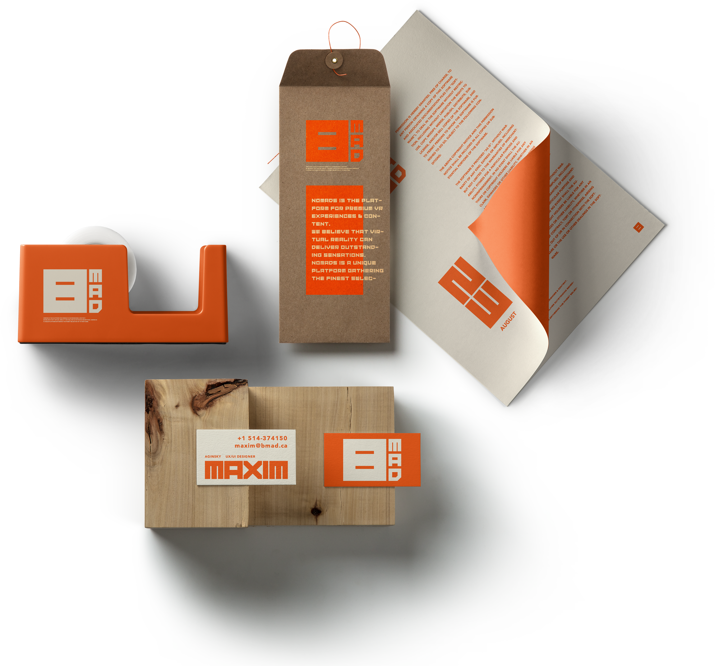
Stationery.
BMAD – this is exactly what you need to see on the front page of your morning newspaper. This message will definitely help you wake up.

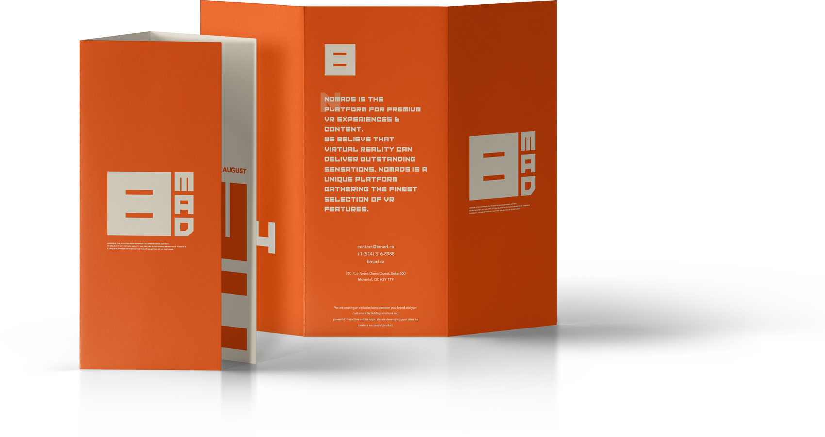
Tri-fold brochure US A4.
Logo variants
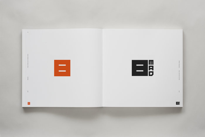
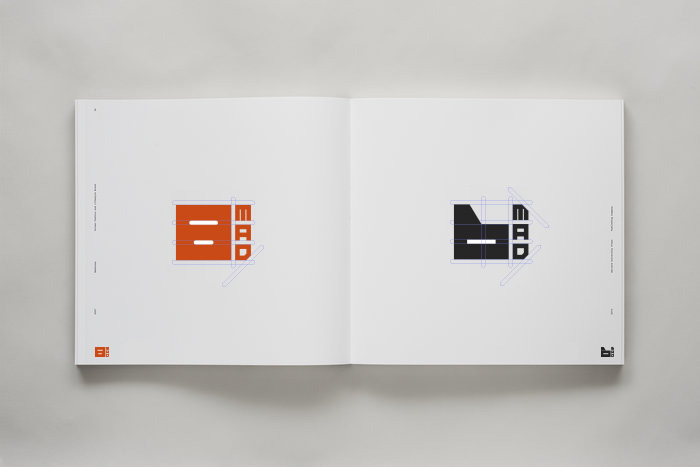
First try to create a crown logotype.
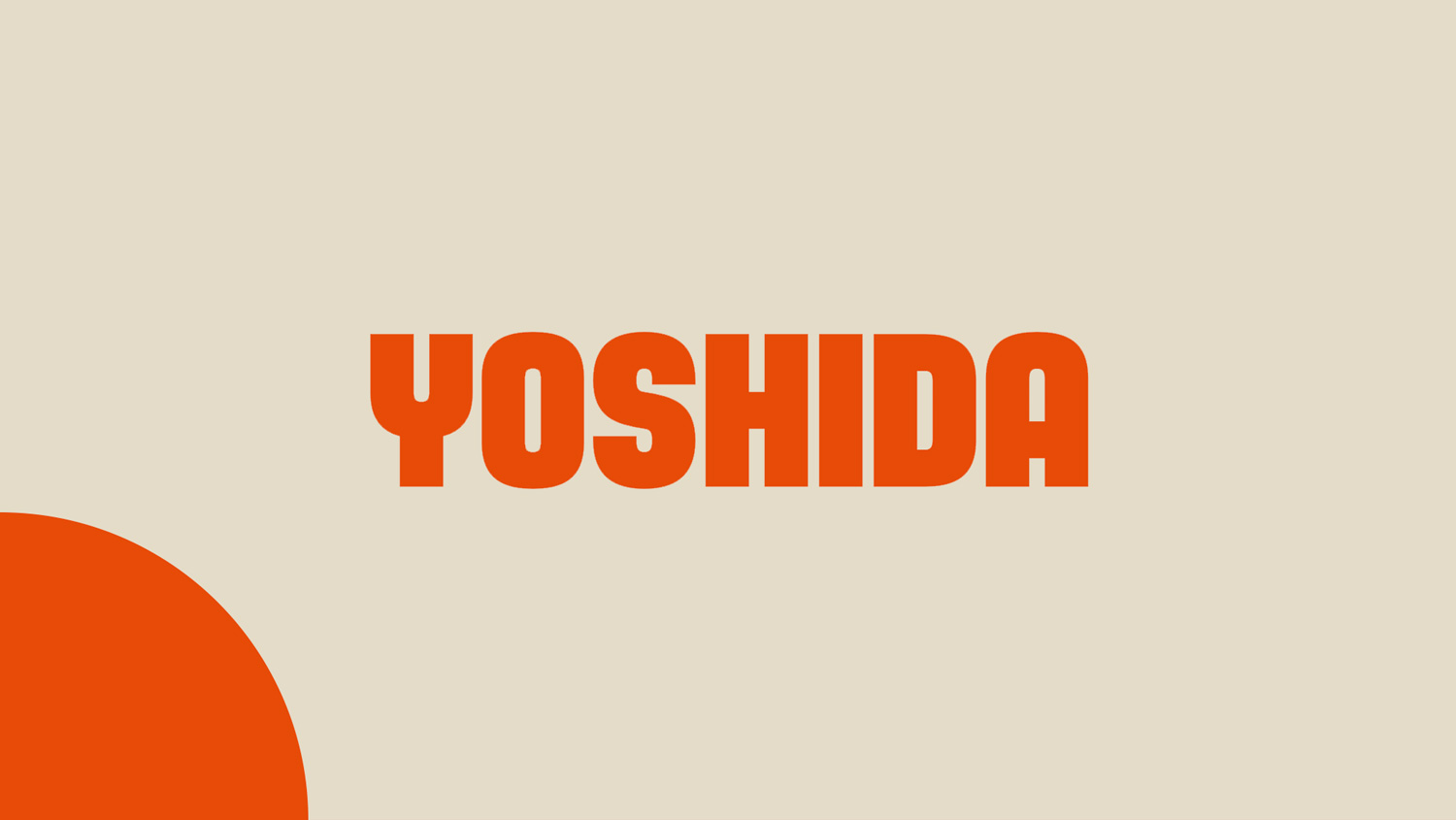
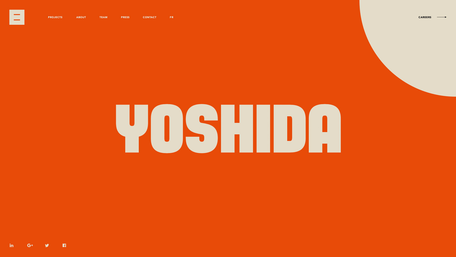
Yoshida Sans typeface
Here are a few tests using Yoshida Sans black font. The word Yoshida in following examples in use as a placeholder for the text.
Yoshida Sans is a contemporary typeface created by Dan Jones and published by TypeUnion, it comes in 2 widths (Regular & Condensed) each with 8 weights (from Thin to Black) and italics, with 32 styles.
Intro and Home screen. August 22
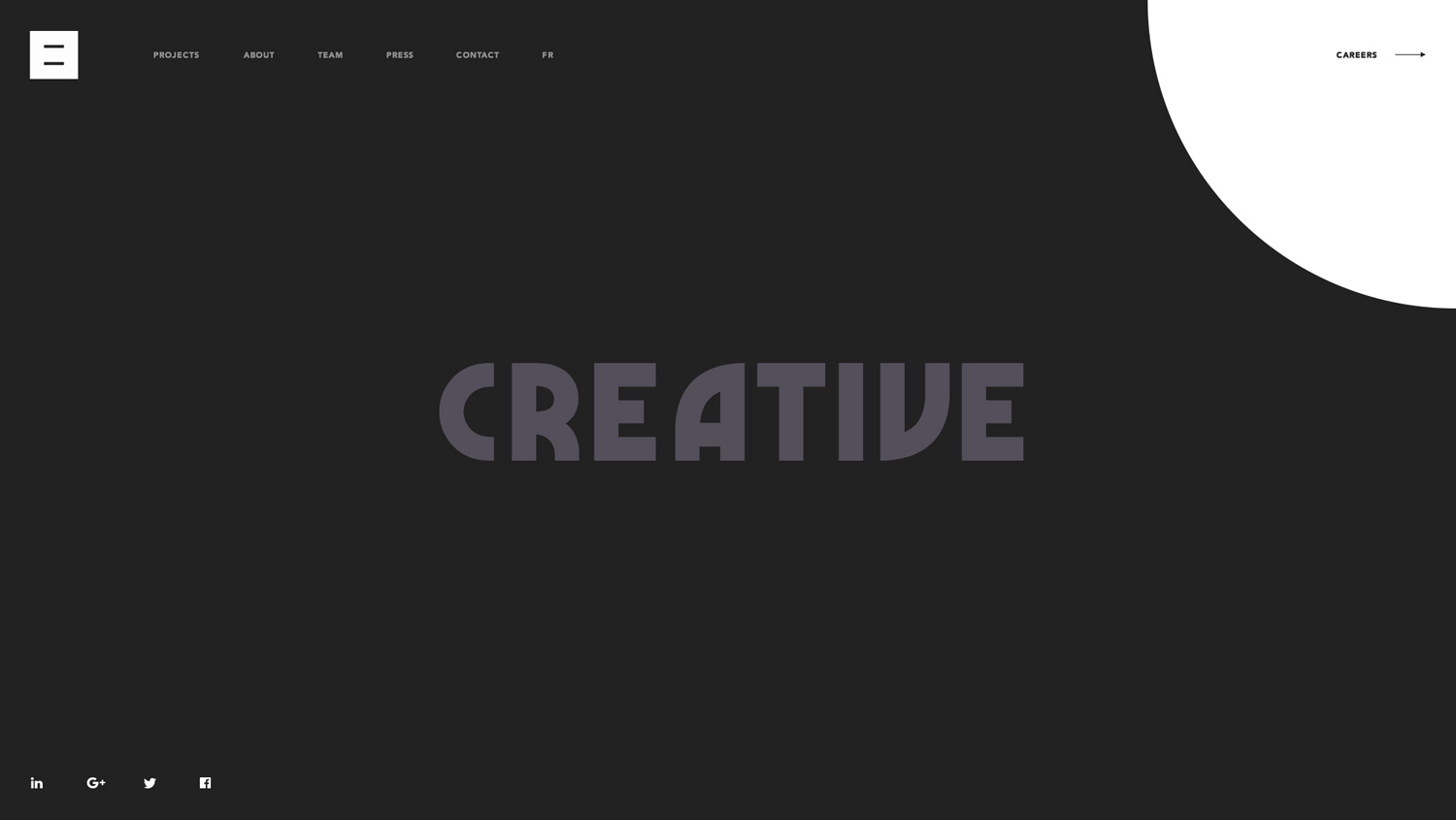
Marvin Visions - bold, uppercase font
Example of the website home screen using Marvin Visions font.
BMAD visual identity. First version
Two variants of the logo appearance or icon and logotype.
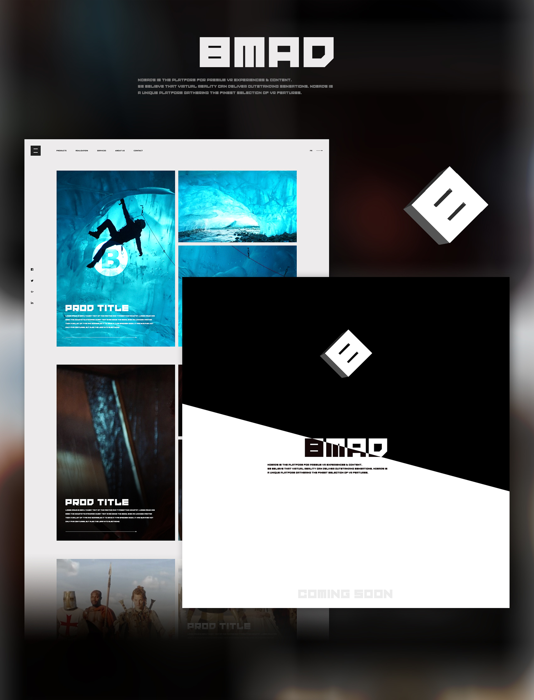
Website progress overlay + 3D logo.
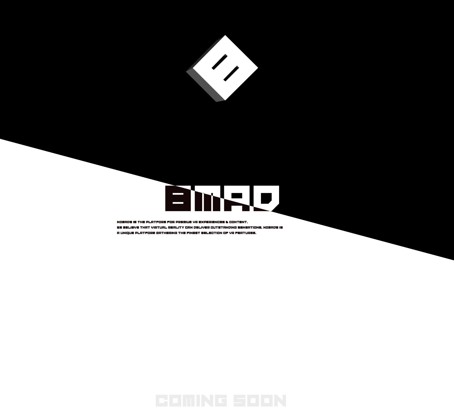
Website home page anatomy.
Home and progress website pages.
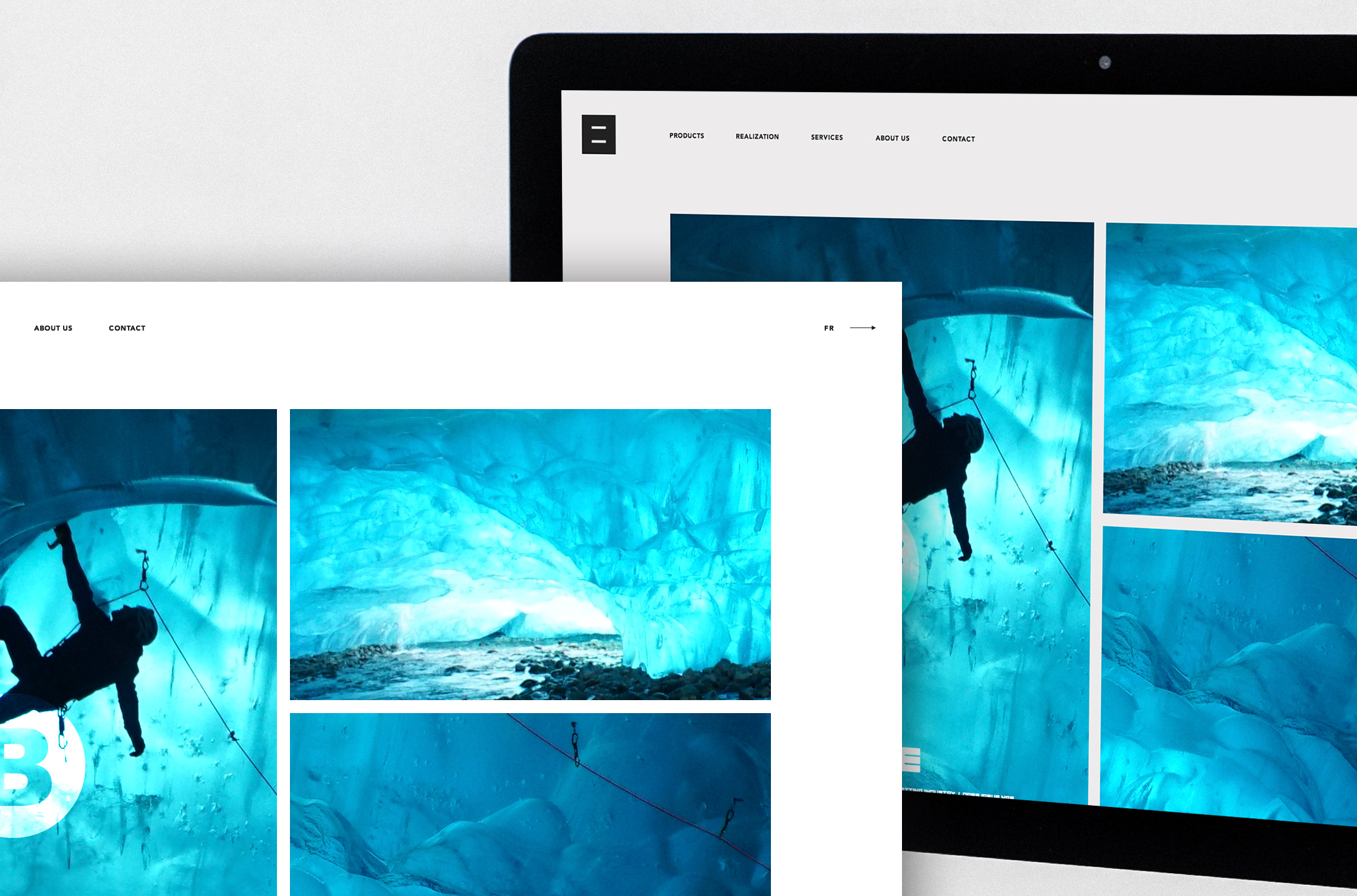
Website home page close up (arrow and logo).
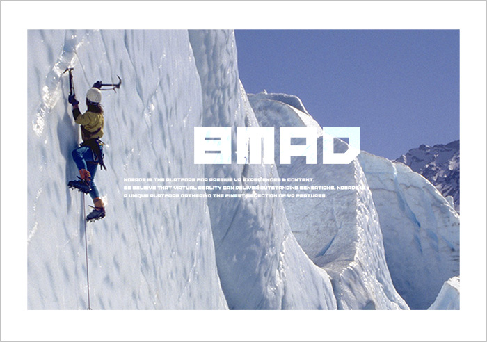
Logo and logotype.
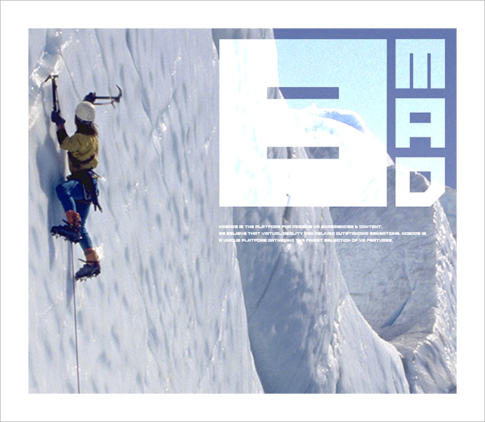
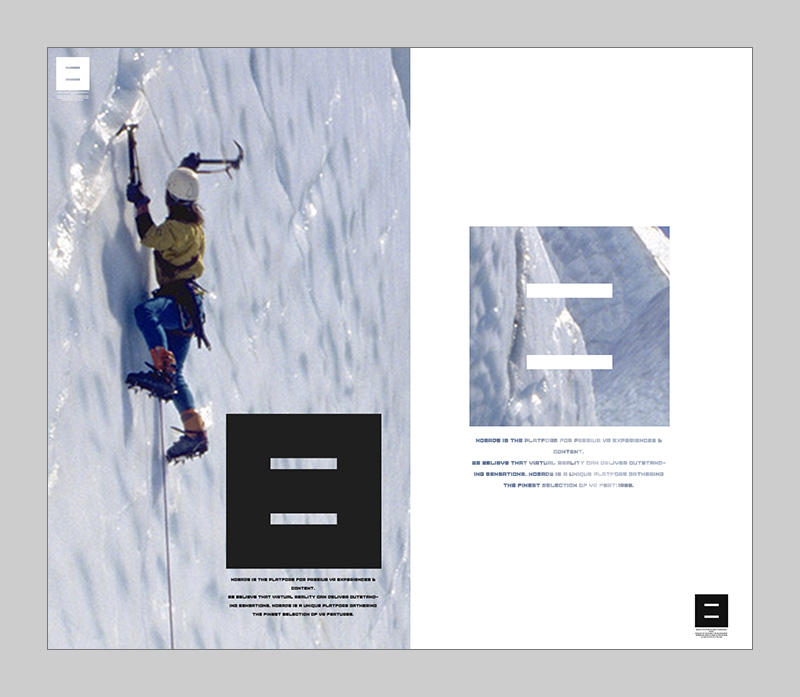
Invitation cards.
