WordPress themes
Create a website with Web Talk To using our theme & web hosting (or our theme and your hosting). All you have left to do, is filling in the pages with content to get your dreamy website.
Any field in which you take part, you will be able to find suitable theme for your website and enjoy beautiful design.
Choose the look/theme for your website now.
Toys Store
August 2013
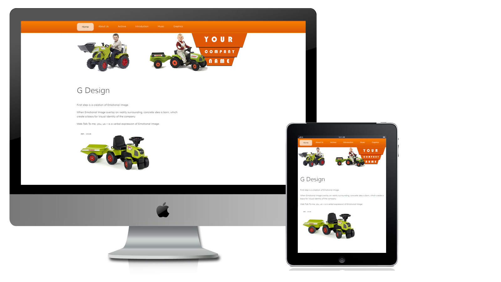
Features
Features: Responsive Design. Responsive Header. Responsive Navigation Menu. One Column. Two Columns. Custom Header (Shows a different image on each page. Image dimensions: 1100 x 250 pixels). Right Sidebar. Widgets. Default Page Template. Editor Style. Blog. Threaded Comments.
Mobile Layout
Toys Store theme intended to be viewed on any size device. It will have great look from smartphone and tablet as well, as on the desktop computer screen.
Related links
Starts as a White Theme, finished as a Toys Store
Popular
June 2013
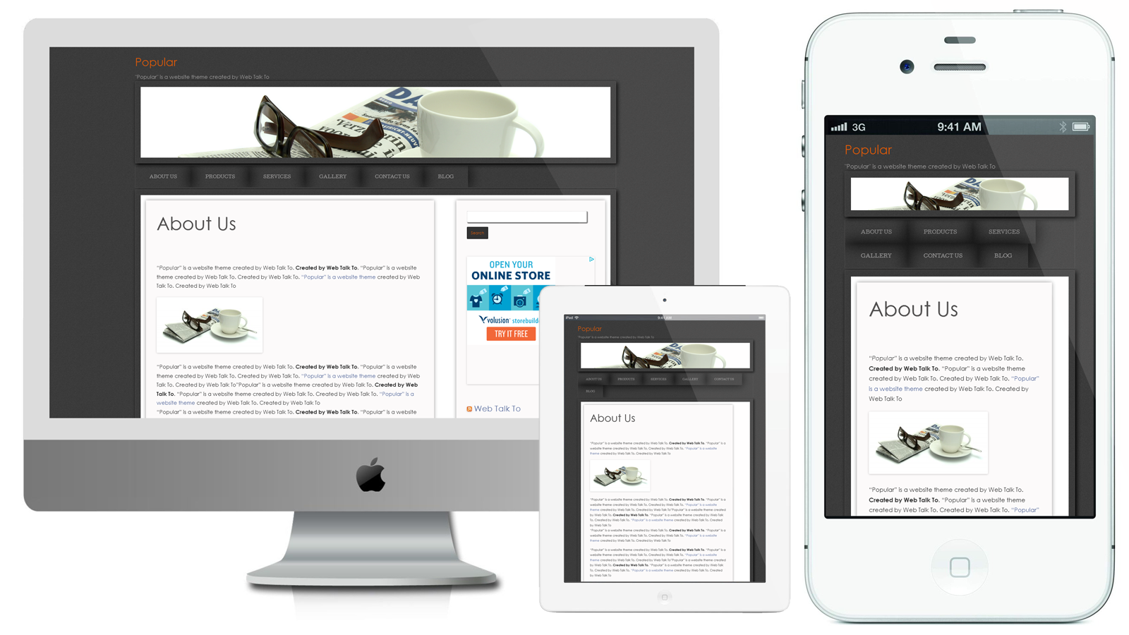
To tell a god story you need to have a "real" one.
Since I started creating themes for website, some years have passed.
Recently I decided to check which theme is more popular. I found that the most popular is Theme No.7.
We are offering very different themes. We have clever themes, beautiful themes and simple themes. Theme No.7 is a simple theme. The theme has dark background, header slideshow and also has no "smart" surprises.
It appeared that this theme style is more pleasant to the client.
As experiment we decided to develop a new theme, based on that fact, that people give the preference to simplicity and clearness.
This is how the idea of Popular theme was born.
Popular has the minimum necessary of functions PHP and CSS code, that facilitates the site architecture and make it very speedy when loading pages, which is important positive indicator for any site.
There is an option to use different header image on each page.
The theme is constructed using responsive design:
- Header Image
- Navigation Menu
- Main Content Block
- Right Side Block
Everything is so beautifully and accurately folding at reduction of the size of the screen that allows showing a site using such theme on any devises.
I love the final result.
Features
Features: Responsive Design. Responsive Header. One Column. Two Columns. Custom Header ( Show a different image on each page. Image dimensions: 2000 x 300 pixels). Right Sidebar. Widgets. Custom Menu. Default Page Template. Full Width Page Template, No Sidebar. Editor Style. Blog. Threaded Comments.
Mobile layout
Popular intended to be viewed on any size device. It will have great look from smartphone and tablet up to the HiDPI screen.
One Canadian
June 2013
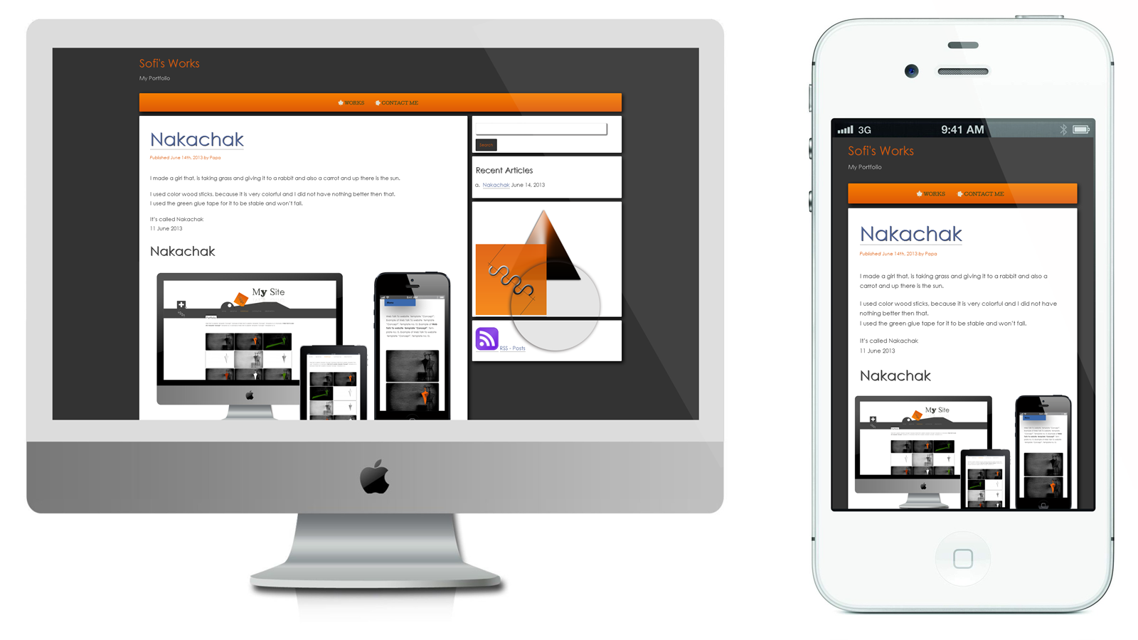
Features
Responsive Design. Two Columns. Right Sidebar. Widgets. Custom Menu. Editor Style. Blog. Threaded Comments.
Mobile layout
One Canadian intended to be viewed on any size device. It will have great look from smartphone and tablet up to the HiDPI screen.
Related links
Copenhagen Festival Ensemble using modified One Canadian theme.
Responsive Navigation Menu for One Canadian.
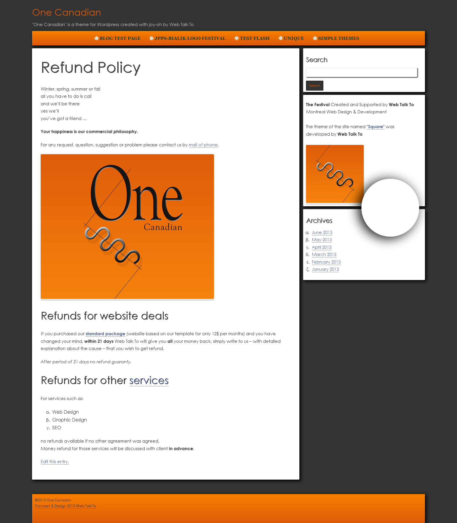
Screenshot
Square
June 2013
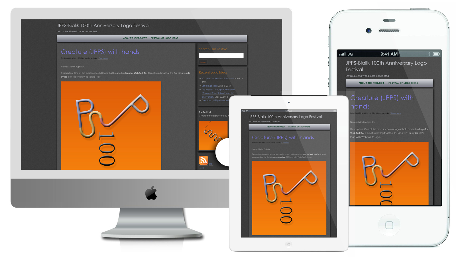
Features: Responsive Design. Two Columns. Right Sidebar. Widgets. Custom Menu. Editor Style. Blog. Threaded Comments.
Read about Square and see a live demo
Concept
January - April 2013
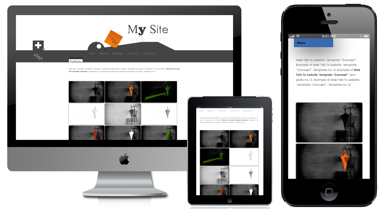
Features: Responsive Design. One Column. Two Columns. Header Slideshow (image dimensions: 1000 x 320 pixels). Custom Menu. Default Page Template. Front Page Template. Full Width Page Template, No Sidebar. Widgets on Pages. Right Sidebar. Widgets. Footer Widgets. Blog. Threaded Comments.
Read about Concept and see a live demo
Paul Motian Theme
March 2013
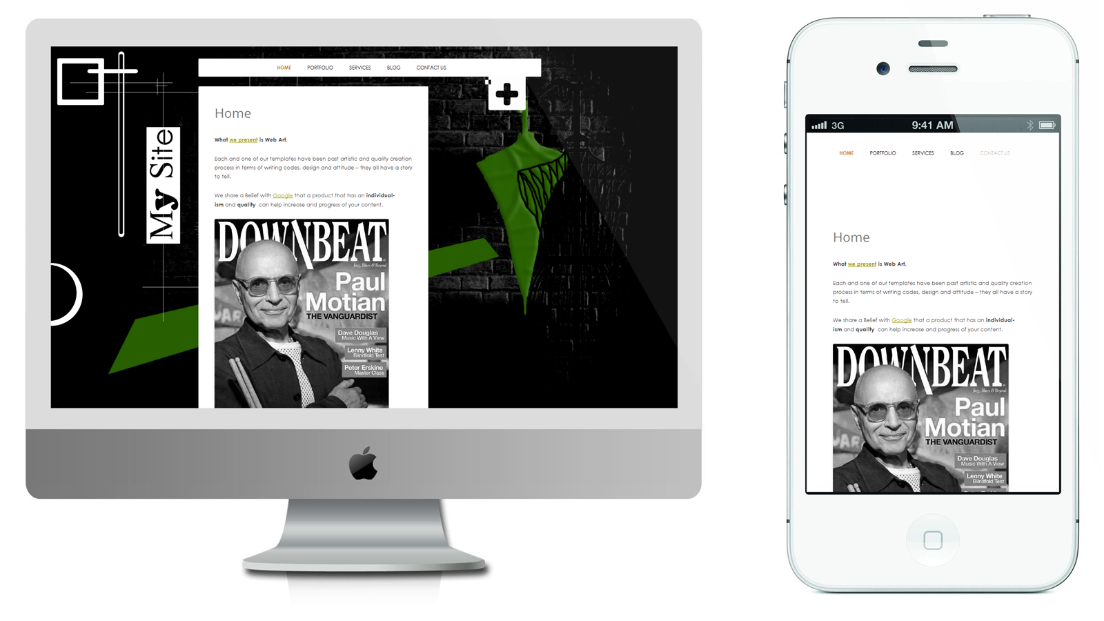
Features
Responsive Design. One Column. Two Columns. Background Slideshow (image dimensions: 1440 x 866 pixels). Custom Menu. Default Page Template. Front Page Template. Full Width Page Template, No Sidebar. Right Sidebar. Widgets. Blog. Threaded Comments.
Mobile layout
Theme Concept intended to be viewed on any size device. It will have great look from smartphone and tablet up to the HiDPI screen.
Related links
"Stephen Paul Motian (25 March 1931 – 22 November 2011) was an American jazz drummer, percussionist and composer. He first came to prominence in the late 1950s in the piano trio of Bill Evans, and later led several groups. Motian played an important role in freeing jazz drummers from strict time-keeping duties."
About this great man on Wikipedia
Holes Idea. Paul Motian & Philosophy of Emptiness
Screenshot
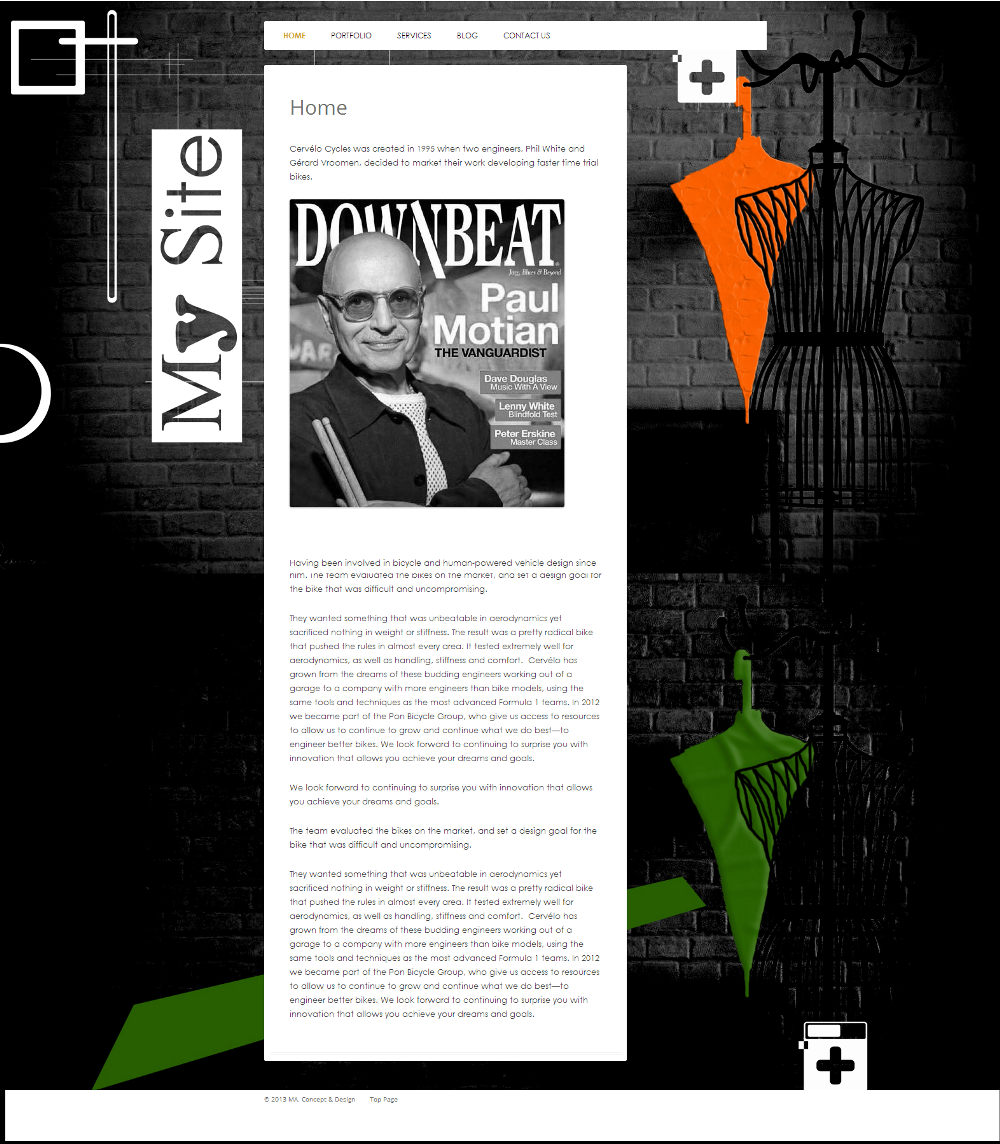
Each of our themes is created with pleasure (maybe even with love), without rushing. All of them edited not once before we publish them, and even after publication we are continuing to work to improve them.
In terms of design they all have a story to tell.
We share a belief with Google, that a unique and quality design will help increase the interest to your "content".
Unique
December 2012
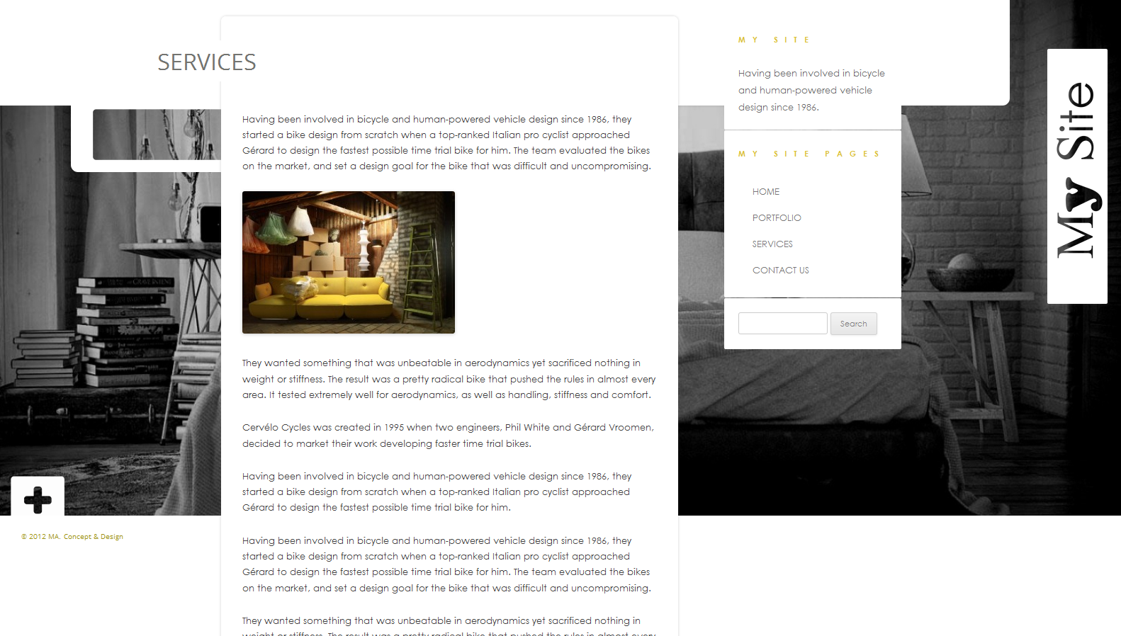
Features
Responsive Design. Two Columns. Background Slideshow (image dimensions: 1440 x 866 pixels). Custom Menu. One Page Template. Right Sidebar. Widgets. Blog. Threaded Comments.
Mobile Layout
Theme Uniquet intended to be viewed on any size device. It will have great look from smartphone and tablet up to the HiDPI screen.
Read links
Holes Idea. Paul Motian & Philosophy of Emptiness
Theme No.9
December 2012
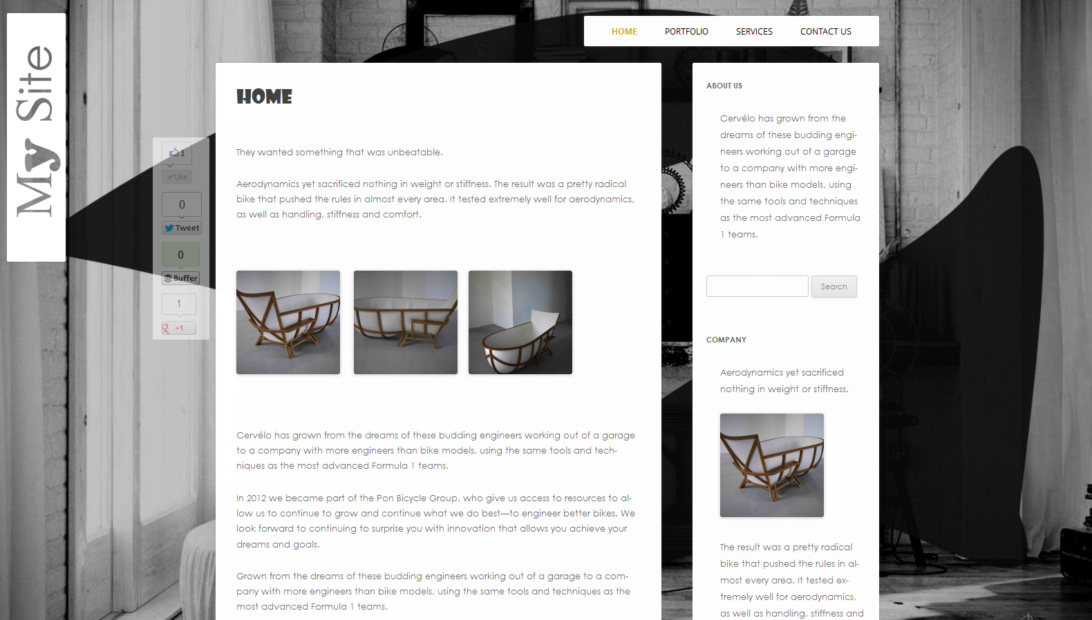
Features
Responsive Design. One Column. Two Columns. Background Slideshow (image dimensions: 1440 x 866 pixels). Custom Menu. Default Page Template. Front Page Template. Full Width Page Template, No Sidebar. Right Sidebar. Widgets. Blog. Threaded Comments.
Mobile Layout
Theme No.9 intended to be viewed on any size device. It will have great look from smartphone and tablet up to the HiDPI screen.
Related links
Holes Idea. Paul Motian & Philosophy of Emptiness
We give you the privilege not to deal with: installations, data base, hosting or other complications. You need zero technical knowledge; all you have to do is fill in your website with the desired content and share it with the world…
Theme No.8
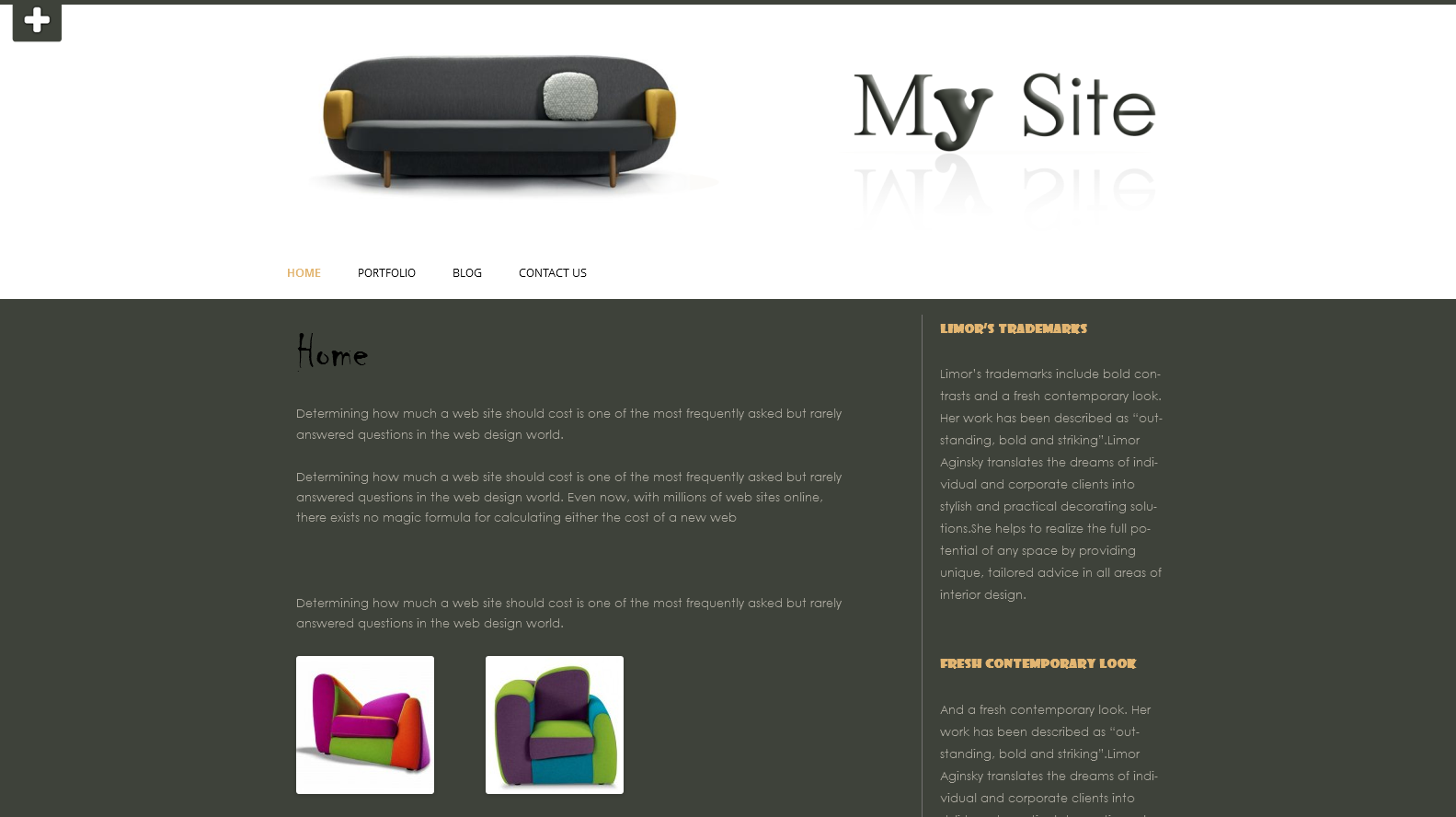
Features
Responsive Design. One Column. Two Columns. Header Slideshow (image dimensions: 960 x 250 pixels). Custom Menu. Default Page Template. Front Page Template. Full Width Page Template, No Sidebar. Right Sidebar. Widgets. Blog. Threaded Comments.
Mobile Layout
Theme No.8 intended to be viewed on any size device. It will have great look from smartphone and tablet up to the HiDPI screen.
Theme No.7
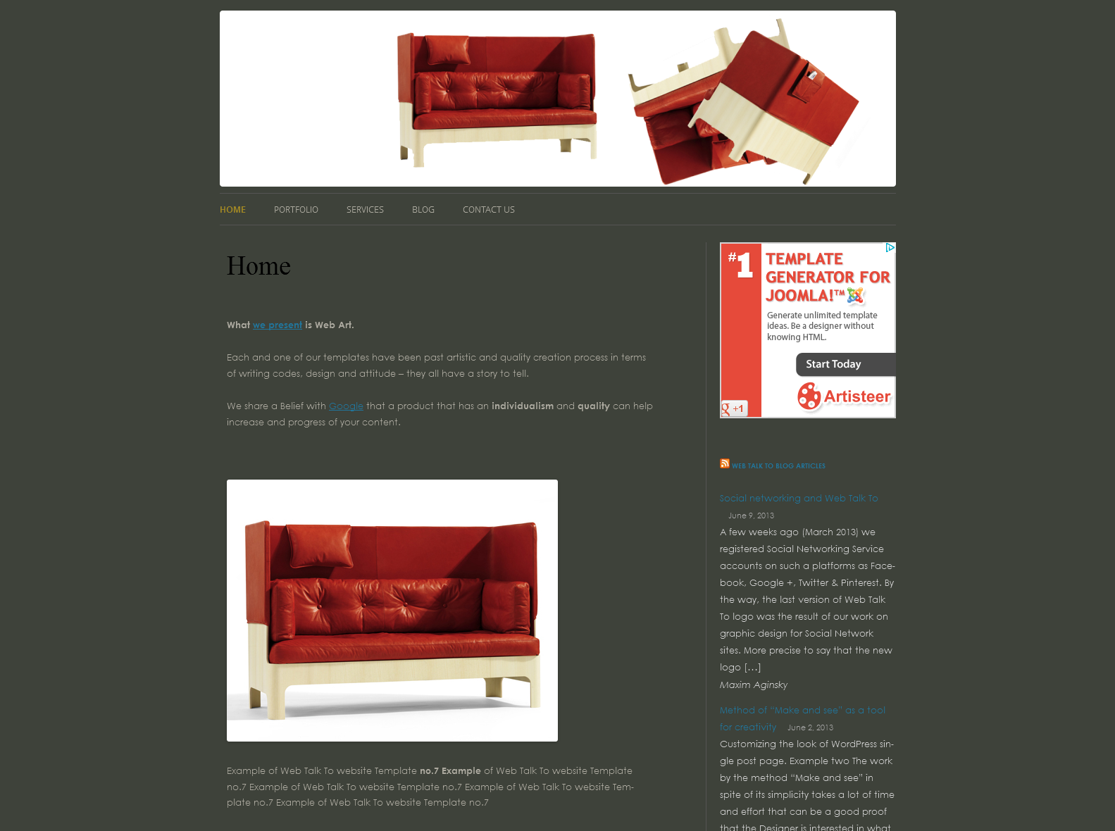
The Theme No.7 for your site on Web Talk To will provide you a great, classic look for your internet project.
Mobile Layout, beautiful header slideshow – Theme No.7 is perfect choice for small business website of any field. And if you desire – not going crazy with many – to make some changes in the design of the theme, we will be there to do it for you.
Theme no.7 is simple, classic and it is easily modified.
This theme can be easy displayed without header slideshow, just with one simple logo image or any other image you wish to have at the top of each page. Just share with us about any changes you wish to make to Theme no.7 and for a small sum we will make any changes for any design details.
Also we can do a beautiful custom design with any photo you like, so for example let's say you have a pet shop and have photos of your cat you want to put in header slideshow, for just few bucks we will provide this service for you.
You can also change the background colors, you can either choose warm or cold color scheme to create any different atmosphere you wish.
You can choose to change the font to the one of you favor, so again for just a small amount we will do it for you.
To get more info regarding the options of different looks of this theme, look at variation of design we have created for Theme no.7 on: Website design sample for WICC.
Features
Responsive Design. One Column. Two columns. Header slideshow (image dimensions: 960 x 250 pixels). Custom Menu. Default Page Template. Front Page Template. Full Width Page Template, No Sidebar. Right Sidebar. Widgets. Blog. Threaded Comments.
Mobile Layout
Theme Concept intended to be viewed on any size device. It will have great look from smartphone and tablet up to the HiDPI screen.
Theme No.6
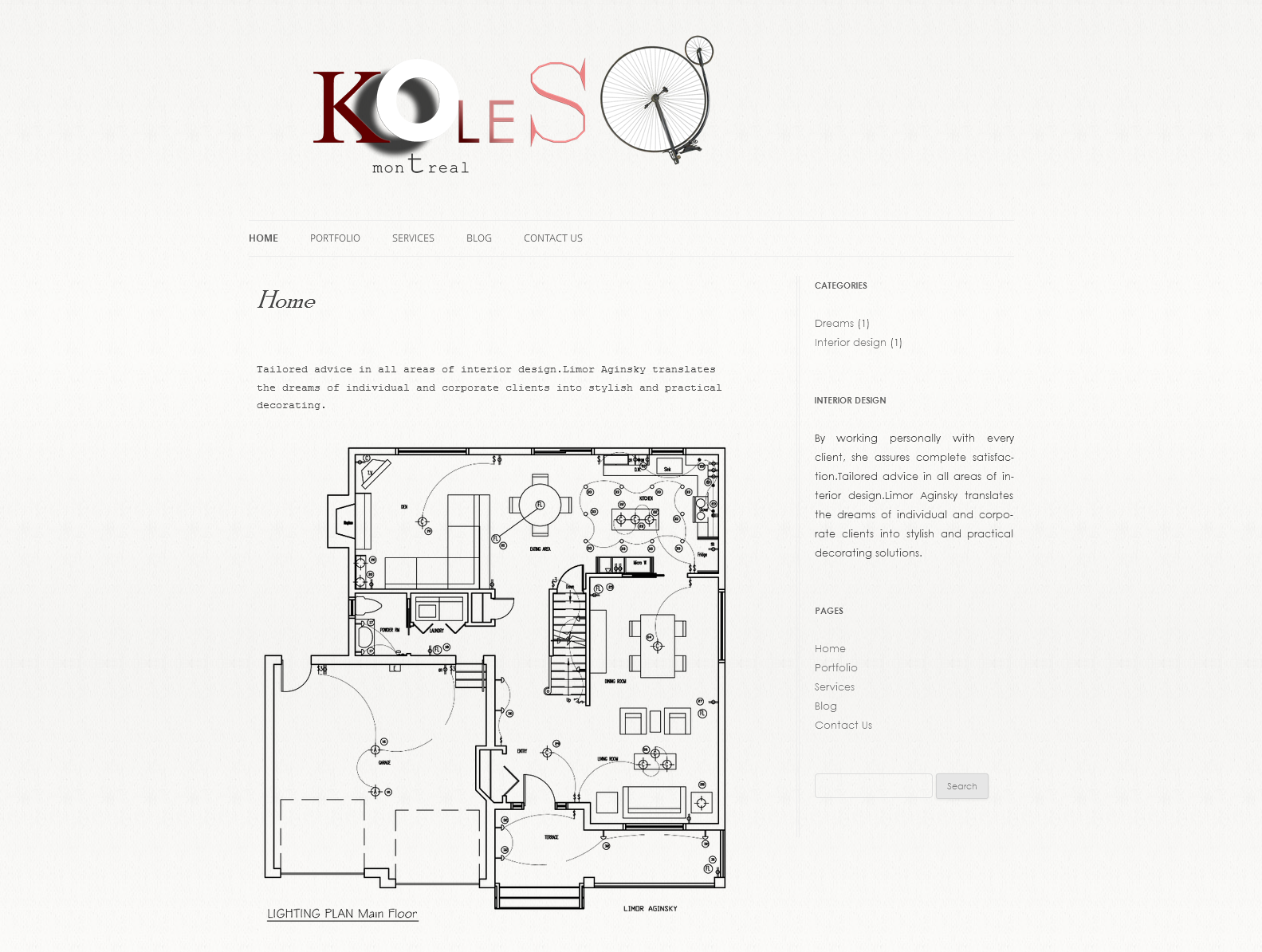
Features
Responsive Design. Responsive Header. One Column. Two columns. Custom Header. Custom Menu. Default Page Template. Front Page Template. Full Width Page Template, No Sidebar. Right Sidebar. Widgets. Blog. Threaded Comments.
Mobile Layout
Theme No.6 intended to be viewed on any size device. It will have great look from smartphone and tablet up to the HiDPI screen.
Simple website themes
The common aspiration goes to the direction of uniqueness, "no-face" . We are choosing the opposite direction of individual and special.
Simple Themes. Examples of customization
Simple. Theme No.5
2012
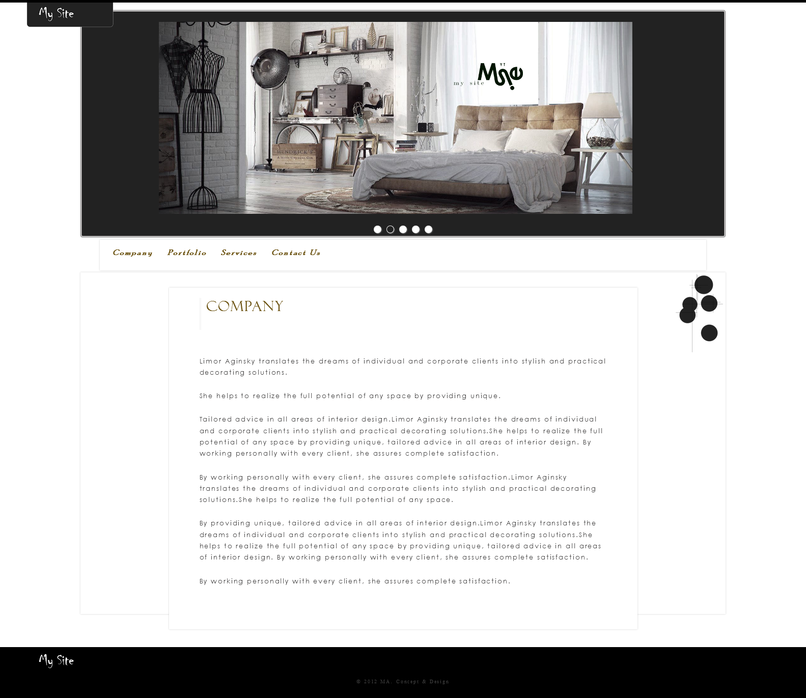
Features: One Columns. Fixed Width. Header Slideshow (image dimensions: 930 x 377 pixels).
Simple. Theme No.4
July 2012
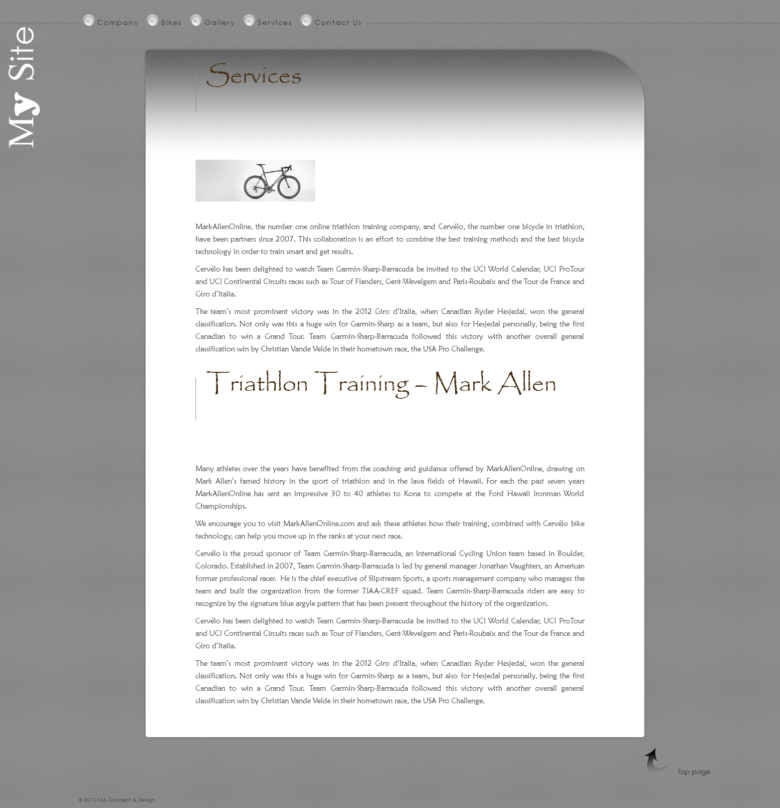
Features: One Columns. Fixed Width.
Google declares: be original and live your life (the physical and the internet) fully. Make the most of all its potential, appreciate your own time. We believe in the same religion.
Simple. Theme No.3
September 2012
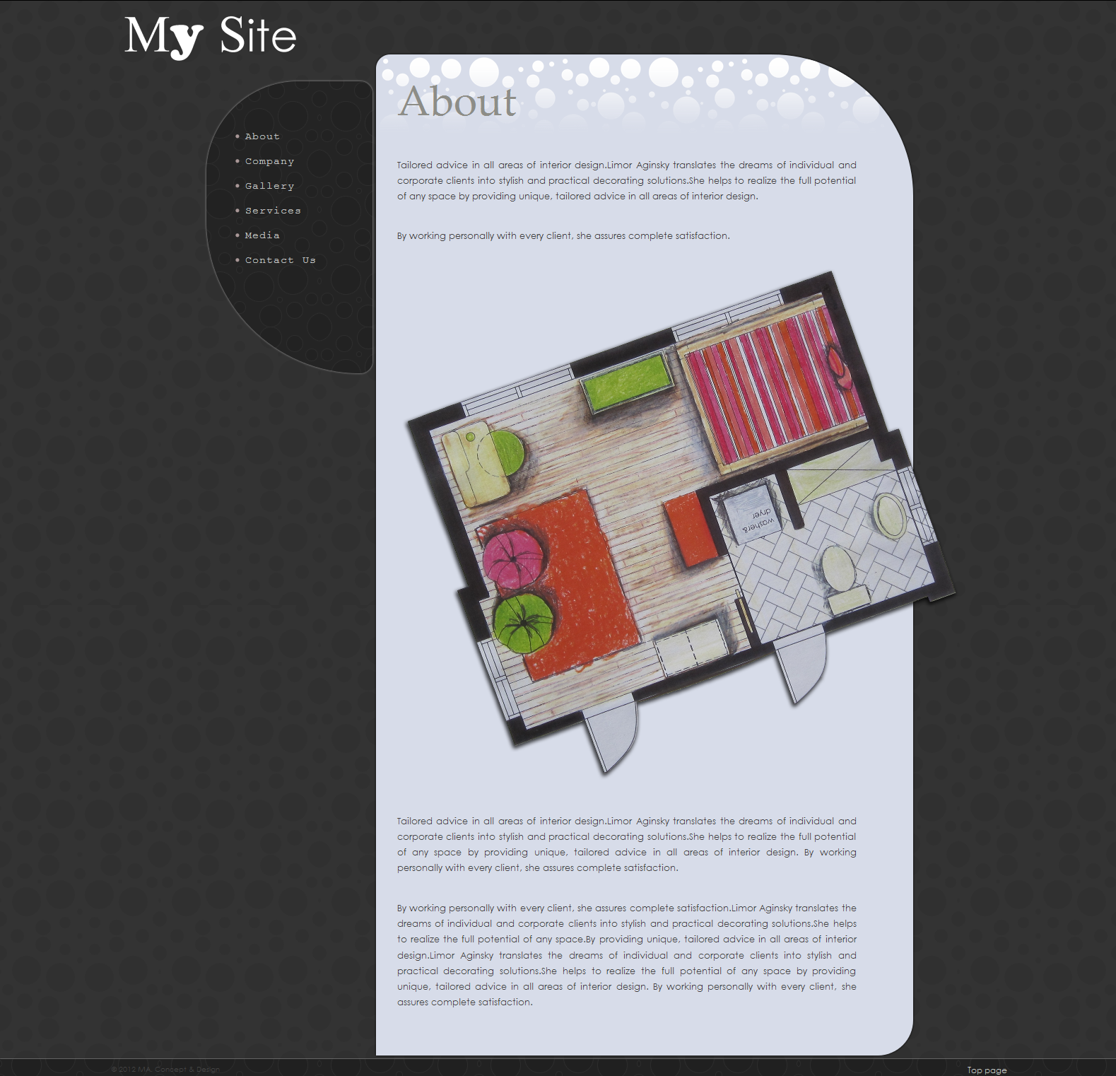
Features: One Columns. Fixed Width.